The red arm bands are terrible.
Sometimes simpler is better. Just a black guernsey with the poppy sash is fine
5 Likes
Yeah, red arm bands look off and the sash is too droopy but the black background for the Amart logo looks brilliant - I’m surprised nobody thought of that earlier.
2 Likes
I think we could make top 4 and a prelim or grand final like pies last year and crows / richmond dogs before that
It’s all coming together for us
besides west coast there are no real stand outs, geelong look good but reckon they are overrated adelaide are not the team they were a few years ago hawthorn swans usual suspects arn’t as strong anymore, pies are good but not great, tigers are decimated by injuries, dees have problems
the stars are literally aligning for us, it’s like everyone is falling down except us. I think we could go all the way
I can’t wait till it’s grand final day and Shiel bursts away from a pack and kicks a goal on the run from 50
3 Likes
Donnington pls
5 Likes
The poppy sash jumper will always look good.
This is the least good looking one ever, though.
I agree the black Amart is an improvement.
1 Like
Donnington doesn’t do things by half
2 Likes
A huge improvement.
1 Like
Gotta get me a couple of poppy scarves this year.
Too much Amart not enough ANZAC
2 Likes
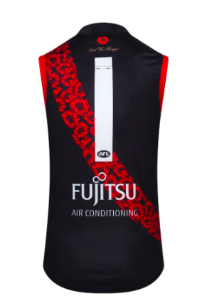
What’s the back look like?
2 Likes
Pendles / Beams / Grundy etc to find out
4 Likes
Didnt even notice the red arm bands until it was mentioned in here
And now that you have noticed them?
Couldn’t care less.
Sash is too droopy though
3 Likes
I couldn’t care less either. Clearly people just want something to whinge about
1 Like
Could be just a matter of taste as well.
1 Like
Can I come back in here?
5 Likes
Fucken othe you fucken rippppppaaaaasssaa.
2 Likes