If you want classic, good graphic design, then I give you this.
![]()
If you want classic, good graphic design, then I give you this.
![]()
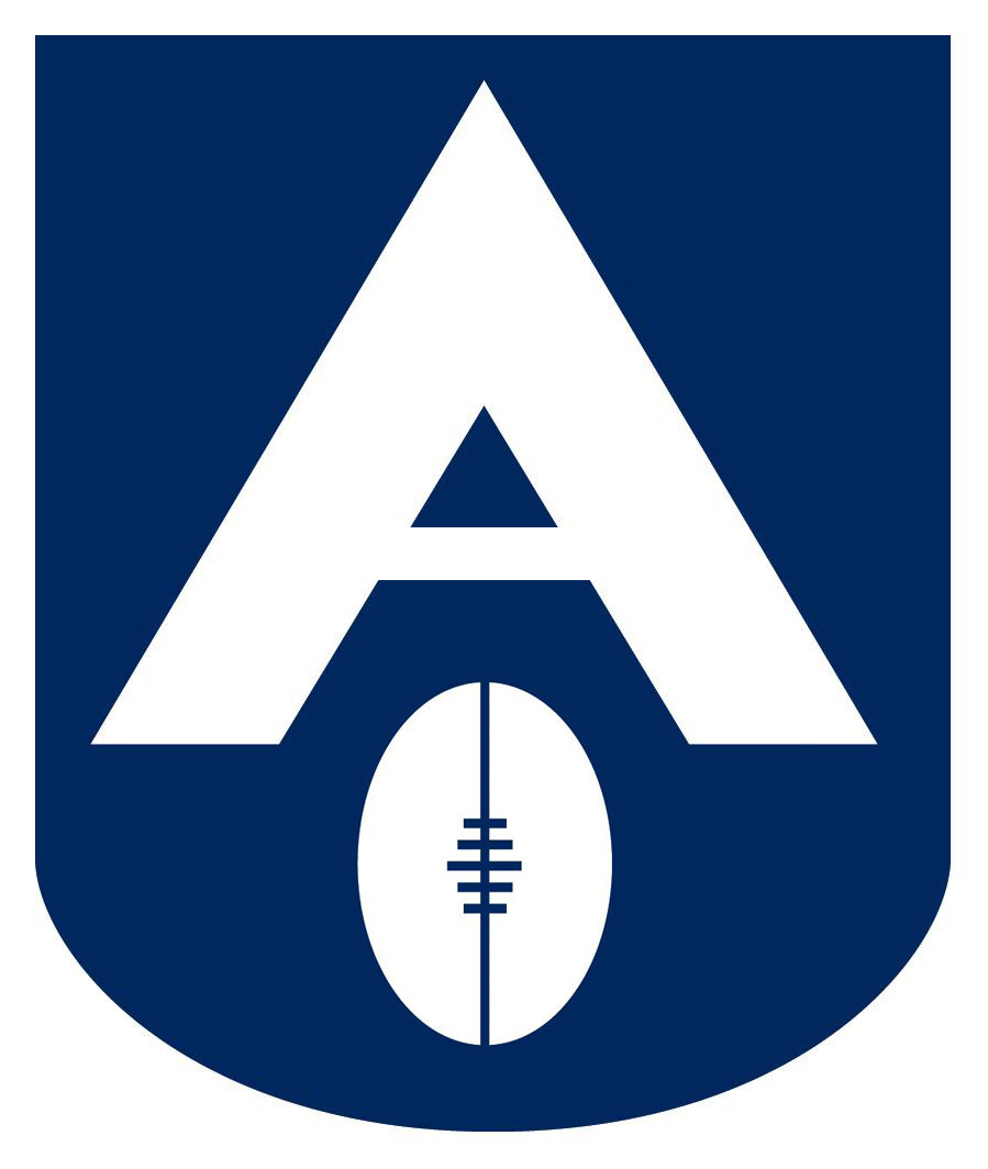
But why? When you look at the old VFL logo, it resembles someone wearing the ‘Big V’, with the football as the head.
What does that represent?? Someone wearing a dunce hat?
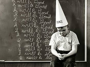
On second thoughts, maybe it is appropriate.
A for Amart ?
The red cuffs match the earlier 2023 leaked jumper, but the Anzac logo says 2022. So this may or may not be real.
I think our normal jumper with a simple poppy ‘pinned’ to the chest would be best for Anzac Day jumpers.
Interesting, normally these people are not too bad.
It’s accurate. AFL squatting over and excrementing on everyone.
Thank God for your last sentence…
For the AGM - can someone insist that all sponsor logos must be a compatible with the clubs colours
Amart, for example, must always be white font on black background. I understand the importance of sponsors but the club needs to hold its ground and preserve the integrity of the guernsey
Broken sash - red trims around the neck and armholes. FFS !
Does no one read or understand the Club Constitution ? Section 1, subsection (e) reads as follows:
The uniform for the AFL Premiership Season must consist of a black jumper or
guernsey with a red sash, red and black socks and white or black shorts. Such
uniform must be worn at all matches subject to the rules and directions of the AFL.
Wonder if there are supply issues with UA again. Still wearing guernseys with the 150 logo
I think at this stage of the year we usually have the previous season’s gear. They’ll probably ‘launch’ the 2023 range in the new year.
Sounds good in theory, but some large companies that are known for particular colours won’t go for that and hence we might miss out. For example, BMW.
Here’s the thing, almost all of those companies have a monochrome or B/W version of their logo for this specific reason.
On the other hand Fujitsu’s logo is in Red Font but they use a white font logo in order to “stand out” against our red sash.
Typically the first few sessions of the new season will be in last season’s gear. Certainly that’s how it’s been in previous seasons…
What’s that - “The eagle flies on Friday” ?
I like it, really like the joining of hands near the bottom.
The girls had similar on theirs, liked that too.
All decent jumpers this year by the looks. A bit innovative with the designs.