I don’t mean to be offensive, but the bird’s head needs a redesign.
Does not look…quite right…
1 Like

1 Like
You’re obviously not familiar with the short-necked Coscoroba Swan of South America…
3 Likes
The jumper Lloyd just handed to Tsatas looked like it didn’t have red trim on the cuffs, only a little bit on the collar. Looked much better. Except for the Amart logo.
1 Like
This photo looks filtered/edited, so that’s probably why the red colour looks washed out, but this is probably the 2023 jumper.
1 Like
And the third UA logo fkd off. Yay
Except the top Under Armour logo looks to have grown in size and now encroaches into the sash.
These yank bastards just can’t help themselves.
2 Likes
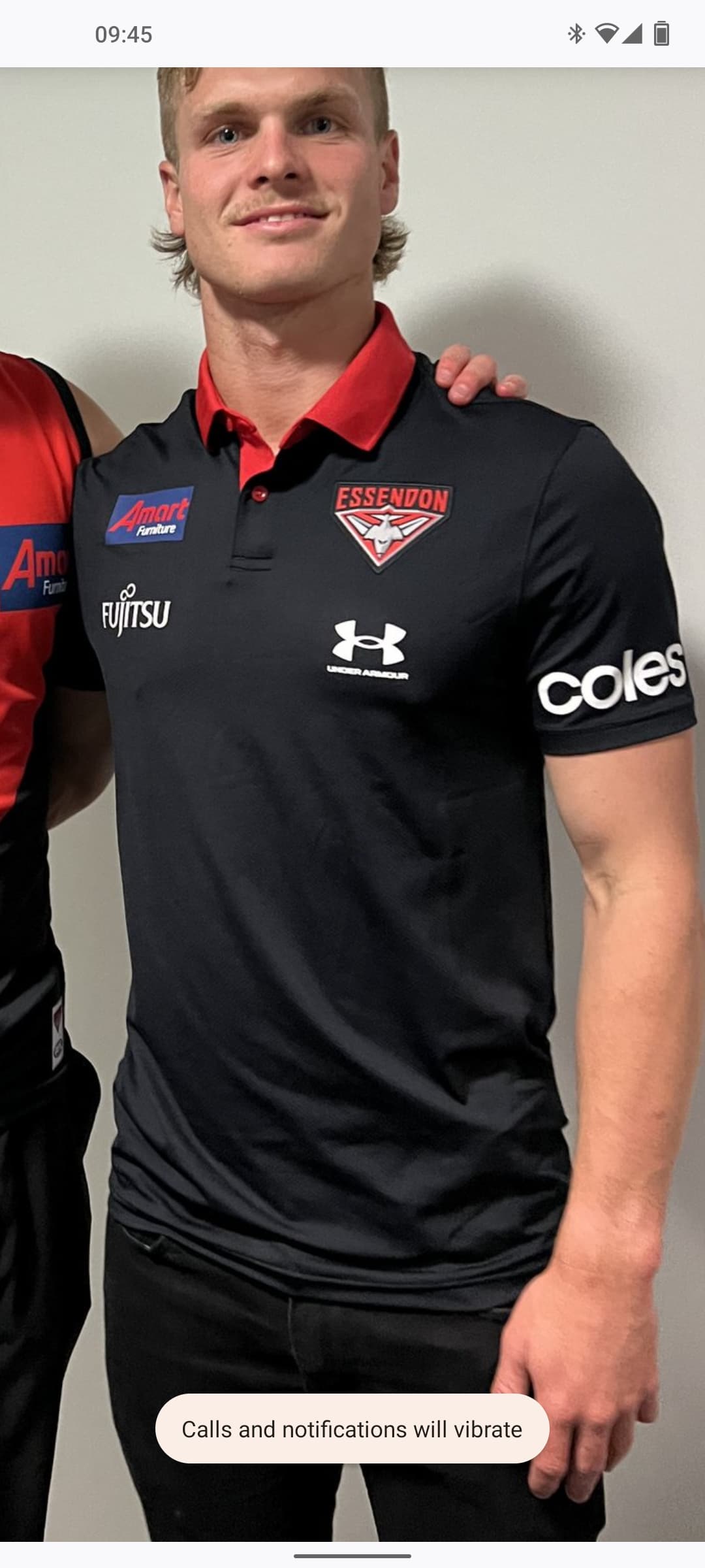
I feel like the Essendon logo is due for an upgrade, it’s starting to look like a patch on a local sports clubs top.
1 Like
So the 150th one was just a one off, and they’ve reverted to the pointy pentagon?
Every one of our other sponsors bar Amart can produce a single tone logo to make the shirt more appealing. Booting these fkers should be high on the priority list of the incoming CEO.
5 Likes
Get rid of the badge style background and writing and keep the plane. Looks crisp and neat imo. But would like to see it in red, rather than grey.
1 Like
Yeh i could go with that, it’s the ‘badge’ style that looks really dated.
1 Like
The jumper is fine, Amart logo not so much.
BMW would look so much better.
2 Likes
It wouldn’t surprise if Coles becomes our next major sponsor. They’ve slowly but surely become more prominent on our UA gear
1 Like
Red writing on white background would look pretty good on the jumper too. Coles and Fujitsu FTW!
Orrrrrrr… they invert their colours and use white writing on the sash like Fujitsu have done on a number of occasions.
AMart must pay a heap to have that blue mess on our jumpers.
1 Like
As must Latitude for the Tigers. The massive blue rectangles on both jumpers are gross. While not thrilled, some Tiger fans happier that NIB modernised their logo on their sash.
Also, found it odd that Brisbane who now have NB as their manufacturer don’t have NB anywhere on their jumper except the bottom left afl/club/manufacturer patch. Instead, they have the Maccas logo where the manufacturer would normally go.
Edit: while most of us hate Amart, I don’t think it’s quite as bad as the Bankwest logo on Freo’s jumper. It is horrendously bad.
1 Like
New 2023 UA gear has dropped on the Bombershop today
https://shop.essendonfc.com.au/ua/
Some stuff in there that I like, such as the UA specific hoodie and graphic tshirt without the other sponsors.
3 Likes