I just threw up in my mouth a bit …
1 Like
My man. Go full EPL.
4 Likes
Yeah, but what about clashing with the grass?
Either the White background (with Black heritage small subliminal names in it) and a Red Sash, or just stick with a Red background (with the heritage small subliminal names in it) and a Black Sash, to mark and remember that black day we caved to wearing a clash jumper at all.
2 Likes
This would be better for them. Clash of the stupid festive jumpers. Wonder how sales are going?
4 Likes
Like the idea BSD, keeping in mind that first and foremost I hate any clash jumper. That one does look a bit like a zed. Anyone who thinks we should drop the red and black needs to take a breath. Fire at night looks so good!
1 Like
Yeah ,… I hope no one thinks I mean put that logo on the jumper, I just meant the shield bit, so there would be no “Z” shape to it, … I mean this in content & style, …
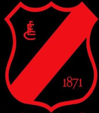
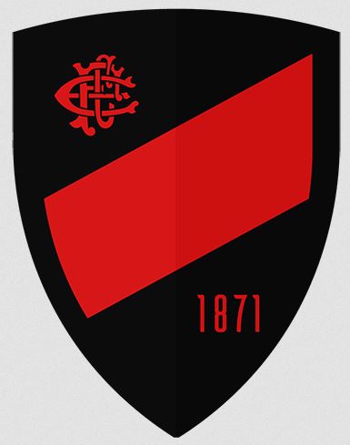
but in the shape of this shield, …
Which is similar to this one, … which is not a bad shape in itself …and is almost it, … bar the stupid way the sash runs,… 
… * Sighs, …  wishes he knew how to Photo Shop …*
Actually that last one on a red Guernsey would look pretty good
1 Like
Big logos on jumpers are also bad
1 Like
It wouldn’t have to be too big
That’s rubbish anyway.
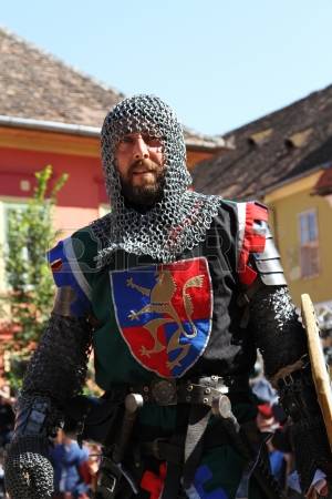
Knights wore their coat of arms on their chest, and/or shield when going into battle.
This is our coat of arms,… our shield, on our chest when we go into battle.
About this size on the Jumper would look great I reckon …
And I don’t know how people can put up with the constant rubbish we are being dealt.
Look your idea is not the worst (that’s saying something as I am as appalled by it as you are of mine) but Richmond tried it and it doesn’t get through. It’s fanciful to even suggest it if you are being realistic to what a clash jumper should actually be, not just cheerleading the club. Clinging to the past, you can spare me the red sash is sacred and absolutely needs to be on the jumper routine, just looks sad on this issue now.
We know now that predominantly red works (let’s not even mention the period red was considered dark, which probably made this whole shambles worse).
I wouldn’t go full Rolo on it, I just want red & black colours, and so far all these variations of red on red with a little bit of black are plain rubbish and always will be. The jumper needs a contrast to look good. I like Richmond’s one, most of their fans I know are happy with it if you take out the emotion. And I reckon they won’t be changing it every year like we seem to be, when some graphic design/advertising gradaute starts working for our incumbent jumper maker/or the club and decides we need to freshen things up a bit…again.
1 Like
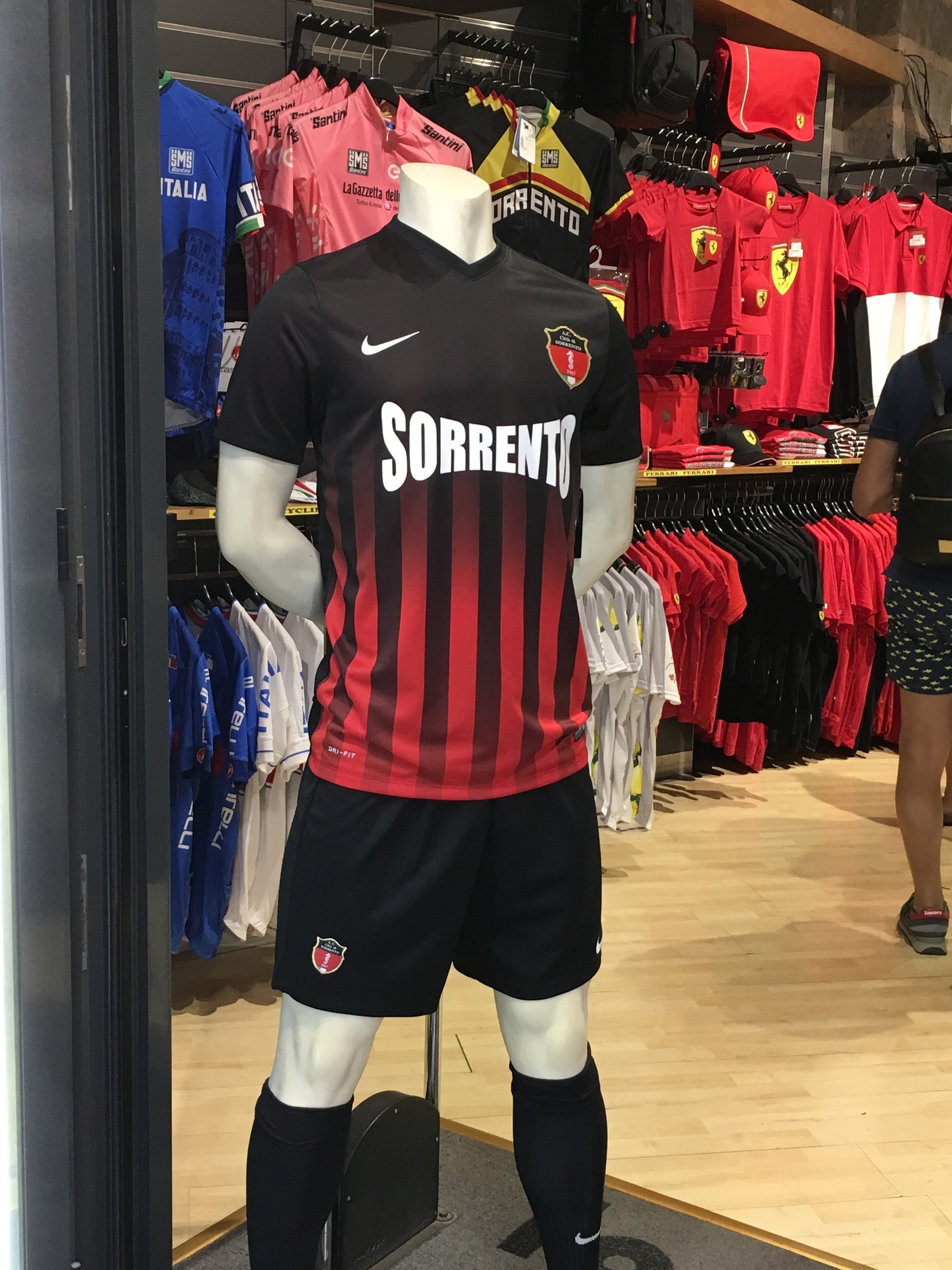
Go full on AC Milan and be done with it.
Apparently one of the early design ideas for the Essendon jumper was red and black stripes but it never went ahead.
Part of me actually wants red and black stripes.
If this refers to the AFL executives who whinge about problems no one has ever had, and who impose this crap on us for no reason other than more $$$ to them, I agree wholeheartedly.
5 Likes
Anyone who gets asked to submit a footy jumper design and offers up anything with a colour gradient needs to have their head immersed in a bucket of phlegm until they learn their lesson.
Or until they stop wriggling. Whichever comes first.
5 Likes
I think you mean “work experience student” rather than graduate.
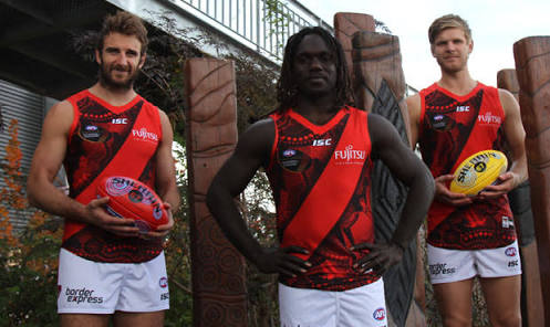
I reckon this could work.
14 Likes
Gradient was great for all my backgrounds in various powerpoint projects back in 2002.
1 Like
Just make this the away Guernsey.
5 Likes
Yep, I agree. I’ve said on here a few times. If we can’t wear our jumper design with our colours, then we have no design and no colour. Yep. White. All white. No red sash, Just white.