But the gradient!
There’s this
http://www.footyjumpers.com/images/I/Essendon-LimeClash-2018.gif , or if you’d like to get everyone to say how great it is, you just need this:
http://www.footyjumpers.com/images/I/Essendon-ClashPride-2018.gif
With this one, it’s not Heritage, it’s a Purple Bombers Pride (Clash) jumper
In this way, if you don’t like it, then you’re homophobic, and no-one wants to be homophobic
Before Mero deleted it:
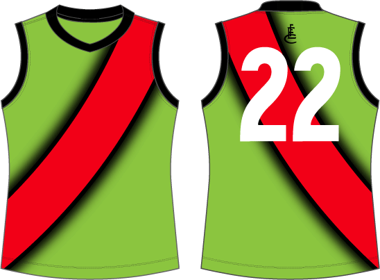
If you’re going to make it crap, go hard or go home.
WON’T SOMEBODY THINK OF THE (colour-blind) CHILDREN!
(Seriously, Essendon and Richmond look basically identical to certain colour-blind people, but I don’t consider that to be a problem because when they’re kids they will therefore choose not to barrack for either team.)
I also tried to include this one
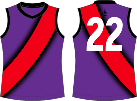
Make the drop shadow a solid stripe. Black / red / black of equal widths. Fluorescent yellow as the alternative colour. Done.
It’s the clashiest clash jumper that ever clashed.
Blame David Hille, not me.
Yep agree. I’ve always thought I would live with the Peru football uniform as our away jumper.
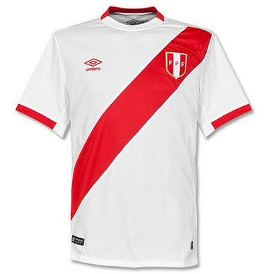
Absolutely!
“But Port (or south?) Melbourne!!” - old people
Who cares.
Look I hate the idea of a clash jumper to begin with, as everyone does. But if we’re going to do one, let’s keep it clean and simple and classic. Over complicated design is always how these clash jumpers fall down.
Anybody who wants any colour other than red or black on our jumper, is a bum.
An absolute bum.
Society nowadays has too many avenues to complain and not enough people responding to say ‘shut the fark up’.
Remove twitter and facebook and the complaining will be reduced.
Oh, I don’t know, I’d say twitter is if anything over serviced by people telling other people to shut up.
Dont think anyone WANTS any other colour, but these pr*cks are making us have a clash guenesy so people are reluctantly suggesting ideas 
The Essendon jumper is black with a red sash. If it’s not all three of those specific things, it’s not the Essendon jumper. To me, being two out of three isn’t better than one out of three.
Of course, I am a bum, so that might explain it.
I cant understand why they just dont do black sash on a red jumper. Reverse it. Really who cares? Its still Essendon. As long as they win, they could wear pink mankinis for all i care…well, black and red ones at least.
We’re not the only team with a sash.
We are the only team whose colours are just red and black. That’s our unique identifier imo.
Personally, I couldn’t care if the jumper had a picture of the ‘saga syringe’ taking a dump on the ashes of D*ick Reynolds, as long as it was red and black.
Anything else is a bum move. An absolute bum move.
Maybe having a black jumper is why we’re so bad? It does absorb more heat after all.
New uniform: White jumper with a white sash. And white shorts. And white numbers. Go Essendon. Hi @benfti
Our standard jumper is a horse.
Our “look it’s kinda our standard jumper but not” jumpers are all camels.
whose colours are just red and black
And white on the shorts, as allowed by the club consitution.
Edit: that’s entirely beside your point. Snark withdrawn.
Thanks Mickey!!!
I’ve contemplated the clash jumper, and in my opinion, either one of these should be our Clash Heritage Jumper year in year out, without any other changes at all…and just be done with it FFS.
Again, make it year in year out, and put it in the constitution.
It’s simple…its RED & BLACK, and still looks Essendon because the basic design remains fully intact.
Would entirely fix, and put and end to all the bullshit that’s been going on ever since we had to start wearing a clash jumper in the first place.
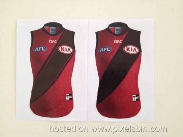
If they can’t help themselves with this new culture of exploiting our jumper for extra cash, by changing & making other fancy jumper versions like they’ve been doing, then they can please themselves and go ahead and make LTD edition jumpers for SALE ONLY, but NOT for ON FIELD WEAR.
For Anzac,Indigenous,and Country rounds, just a nice classy symbol representing each occasion, placed just above either the AFL or Sponsors logo, would be ideal in my mind…year in year out.
P.S. If they just can’t handle not having a red sash on the clash jumper, then again (but not quite as bold and distinctive as above clash versions), this one here…
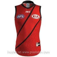
… they had actually planned and made this heritage jumper for this year (even started selling it), but changed it at the last minute for the graduated shadow line non-heratige rubbish jumper, which doesn’t highlight the SASH! WHY!
Also take note Essendon hierarchy, because the buck always stops at you. Now that the Sash is finally perfected… from the HIP (properly on the upper hip side) to SHOULDER (properly fully over the shoulder), and remaining TIGHT across the chest between these two points… DON’T RUDDY CHANGE IT! in any way!
Understand these design parameters, and put it in the constitution!
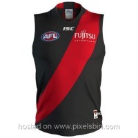
Year in, year out…just see above…full stop.