@Catherine_Lio do your thing.
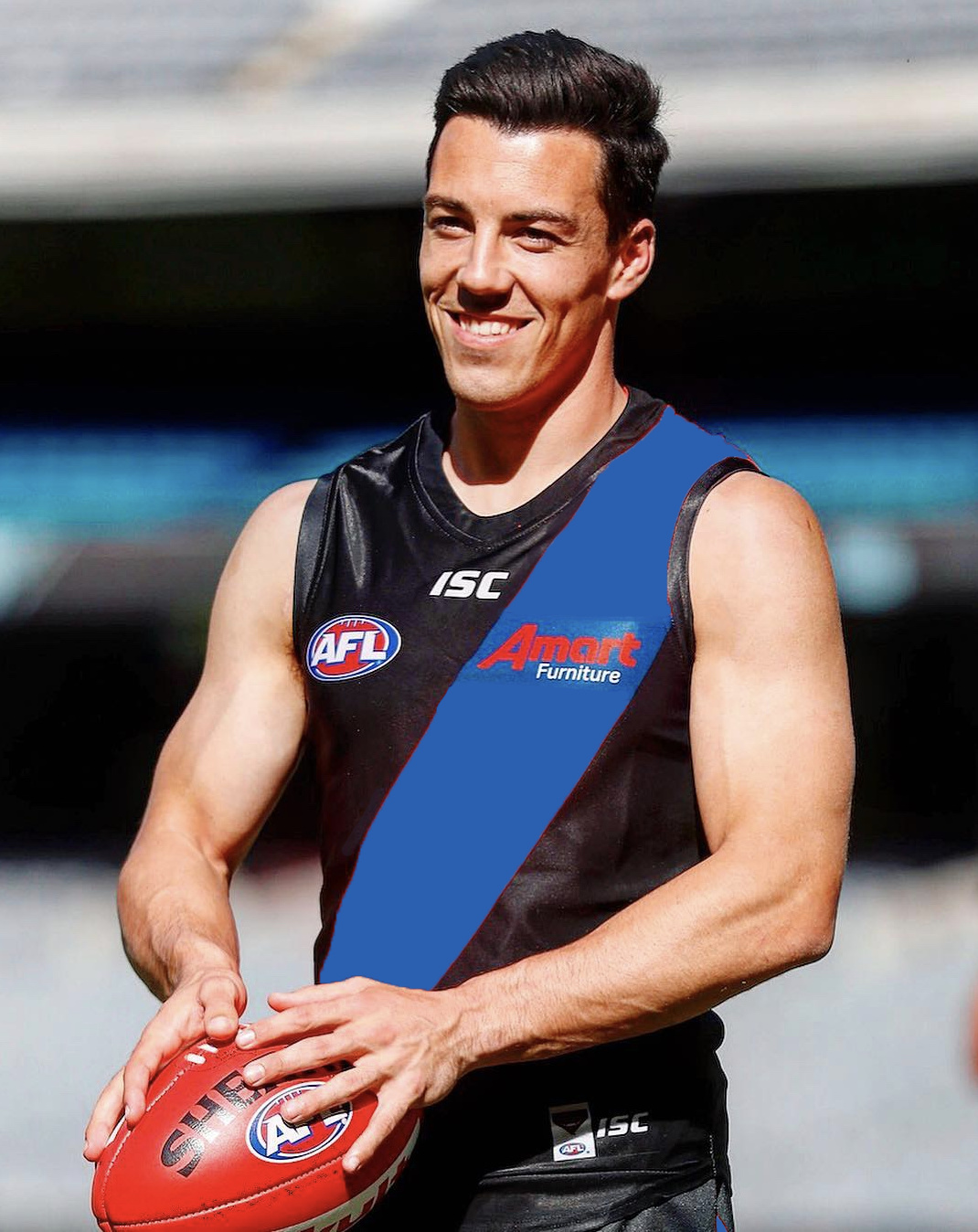
■■■■ that ■■■■■■■ ■■■■ ■■■■■■■ logo off from the ■■■■■■■ sash, you ■■■■■■■ ■■■■■■■.
Heinous.
Honestly, you build an entire marketing campaign around “Don the sash” and then take a steaming, blue tinged dump all over it? Nope. nopenopenopenopenope.
It looks ■■■■■■■ awful.
I’m with @benzina on this.
3 Likes
I don’t know if Calvin Klein could offer the same support regarding any package they could offer.
You slander the Chateaux Cardboard once more and I will smack you like a bad, bad donkey.
2 Likes
I was thinking more of the Fish-Slapping Dance or the Argument sketch.
I want to hear more about this furniture for pelicans business.
2 Likes


1 Like
Don’t have an issue with this. Guernsey looked great before. Still looks great.
Far too many people here have a permanent need for something to complain about.
15 Likes
What the hell chopsuey?
The white works better.
Pity that’s not their branding!
Like your passion but I’m not seeing where the AFL logo impinges on the sash
4 Likes
When the club’s getting 2 mil a year (10 mil over 5) who cares!
1 Like
I think the new jumper with the AMART logo looks marvellous.
1 Like
you monster…
…
yeah, I couldn’t even muster up enough outrage to put it in capitals, or add exclamation marks.
WADDA DOLL
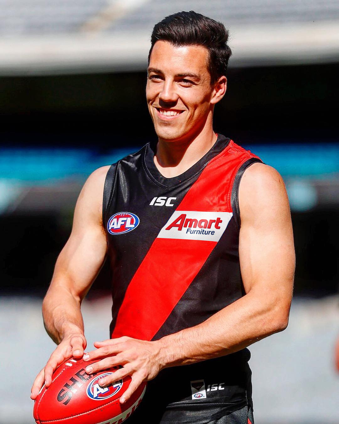
For the first time the logo is shaped to form part of the sash. I can’t decide whether I really really like this or I really really hate it. But i know for sure it’s one or the other.
Update: I like it
2 Likes