Though as a font it’s easily confused with Blitz’s default _I reject your reality and substitute my own _font
2 Likes
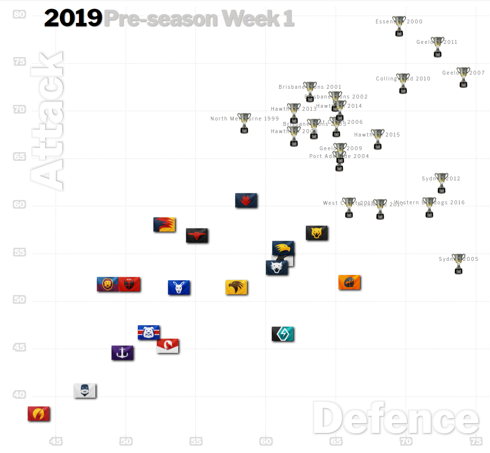
Squiggle has started rating teams , and we eased a bit compared with where we left off at the end of 2018.
They show us as the 4th best attack and 8th best defense in the AFL. fwiw.
No, it’s because you used Comic Sans.
Eh? Eh?
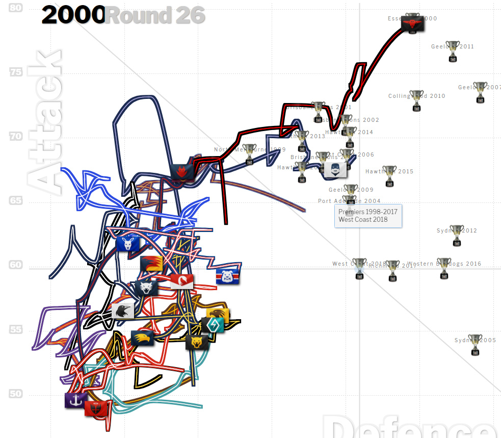
Cleary troubled by Langford’s efforts in the JLT.
We add Daniher and Fantasia to that attack, and Trucks defensive set-ups to the defense, and we should move our way up that graph.
Is that GWS out the front there with the best defence??
Credit to them, I hadn’t noticed.
What the graph doesn’t show - correct me if I’m wrong - the vast amount of points for teams in other years when they did not achieve success despite where they appeared on the graph. So…basically…a graph designed to be attractive, compelling and suit a narrative.
I’ve watched that Squiggle graph for a few years and it’s consistently shown what you see — the historic premiers are distinctly top-right. Some are more top than right, or vice versa, but you have to be somewhere in that vicinity.
2 Likes
Yes, true. But that does not necessarily mean that being in that top right area gives you a premiership, does it? It just means that if you won one - you were there. One does not equal the other - necessarily. So if that is the case - what is the worth of the graph?
Also - it seems that the current points are for 2019 pre-season??? lol…
As currently shown, you generally don’t see many teams in that “premiership cloud” — it doesn’t routinely report that six teams will win the premiership and then claim it works when one of those six does.
Mind you, some pretty average/different clubs have won in recent years.
1 Like
Sorry Deckham - what is your point here? Its a predictive model, they can’t tell the future lol.
It may incorporate the BLT results but if so it’s just one of the last 50 (? haven’t checked, its documented on the site) games — see that Fark Carlton is the clear second-worst team.
Sydney 2005 was an outlier. Incredibly good defensively, quite poor offensively.
Essendon 2000 the most offensive of the lot, ( in the nicest possible way) but also really good defensively.
What I’m trying to understand is - the worth of the graph, without seeing the data that is not listed. For example - teams that would have charted top right, but did not win premierships. This chart tells us that if you won a premiership in the last 20 years, you either scored more than average, defended better than average - or both. Ok, great. It also tells us that in the 2019 pre-season of one practice game, most teams are far behind these premiership teams in terms of scoring and defending.
What am I missing?
As I said, it is based on more than just the 2019 BLT.
I missed that - I was busy typing.
Ok - I am obviously not getting this rather pretty graph.
Its a simplistic model which calculates a offensive metric, and a defensive metric over a few years I believe, and essentially is a 2D probabilistic plot showing that the closer you get to the “zone”, the more likely you are to win. The squiggle plot is a visualisation, but the actual algorithm allows you to predict winners of individual games probabilistically. It also shows you changes in both offense and defense over time, so you can see trends.
You could easily work out your likelihood of winning a flag if you are in that window - number of teams that have ended a season in that window and won, versus not won, then compare it to the same thing outside of it. Squiggle would have done that.
What do you expect it to do?
1 Like
oh I see, you thought it was based off the one game. It would be a rolling average for quite a few games, I think I remember 2 years. I am surprised they include preseason result - it might just be from last year with a regression to the mean.
That would be better - but it says 2019 Pre-Season Week 1. What does that bit mean? That the data is until that point?
2D probabilistic plot showing that the closer you get to the “zone”, the more likely you are to win.
Is this ‘zone’ a fixed zone, or relative to the season? If the latter, is it not just saying that if you score and defend better than your opponents, you are more likely to win a premiership? Because I don’t need a chart for that hahaha…
I don’t think so. Because regardless of where you sit in the graph, it does not tell you how you rate against your upcoming opponent - does it?
Or take into effect any pertinent info like - who’s playing in the team - how that effects the balance and therefore outcome. So it wouldn’t give you a better probability than - well - good footy sense.
This bit is interesting. But only (to me) as a general trend over time, of all teams.
I don’t know what ‘squiggle’ is , but I’ll look into it.