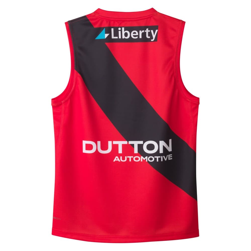
It looks good and puma have nailed the colour as usual, i would prefer the back to be a flat red with a black number though. Similar to the Richmond premiership era away design.
Alternatively simple and effective. Which should hopefully last forever and stop people eventually complaining that what looked modern back then looks dated today.
Which inevitably leads to constant chopping and changing.
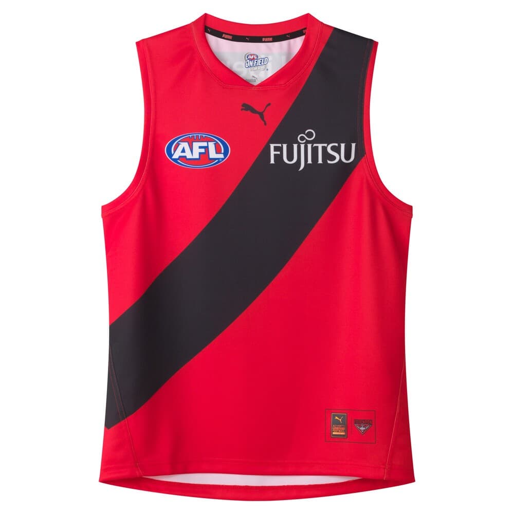
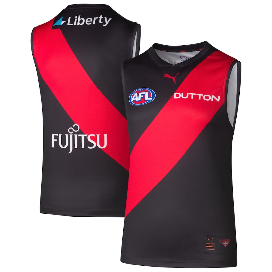
Finally! Just inverted colours of our home jumper…the simplest, and the best solution for our clash jumper all along.
For a clash jumper, it still looks Essendon, just inverted…our simple iconic jumper showcasing our proud tight Sash is timeless, and the Black sash looks good too.
Again, well done Puma! Never change!