The engine contrails indicating a negative g turn, combined with the attitude suggesting a positive g turn does my head in.
1 Like
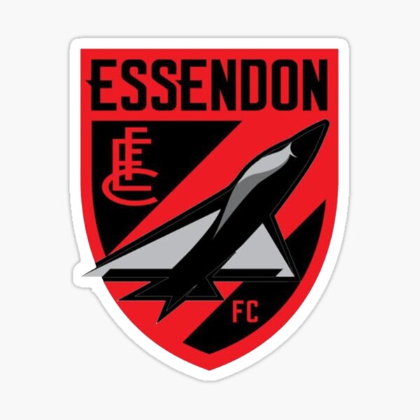
And on the current logo. Swing wings are so 70s. (And prone to issues)
1 Like
@Finding_Nino fix the thread title.
There you go, you can pay me now.
(Ten minutes inexperienced noodling with an actual pic of a stealth bomber).
Dropping a fark carlton bomb. Niche.
18 Likes
I’m not too fussed about the logo. Reckon it’s fine and does a good job for a logo.
3 Likes
Overwing stores carriage also niche
Carlton should bring back their same era ugly as puck version, too.
Found this when I was looking for it.
They’re awesome.
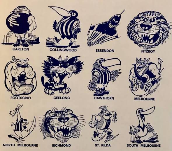
Hawthorn: Smartarse uncle with a beer in his hand at the bbq.
South: Hey! I’m just a cute little swan, I guess?
Richmond: Surprise, MF!
Fitzroy: I’d be dangerous if I hadn’t just been concussed.
Geelong: You stood on my tail!
10 Likes
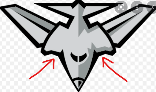
This part of the plane has always bothered me. Planes don’t look like that!
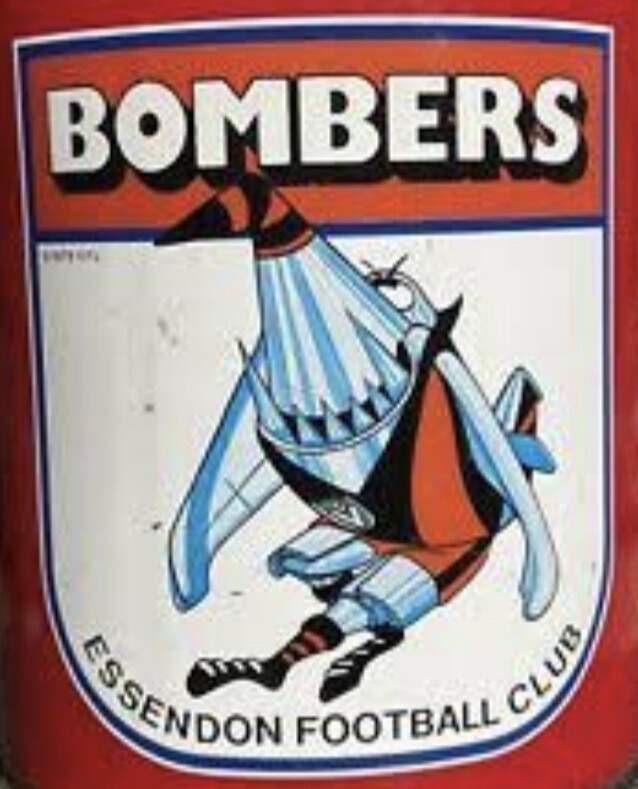
I haven’t bought merch since the 90s.
1 Like
I think those parts of the plane are referred to as the “members intakes”
5 Likes
That is horrible.
2 Likes
Are you saying that you would hate for them to announce that they are announcing the possibility of announcing that one day they may announce a new logo?
1 Like
Nino, you could post in the annual trade thread for the next 1,000 years and I guarantee you’d not come up with an idea as bad as that.
9 Likes
Stop giving him goals to aspire to!
2 Likes
Nino says, hold my beer. 
- I like Nino’s idea
- I hate Nino’s idea
- I think Nino needs to draw up a version in MS Paint for us before deciding
0 voters
1 Like
I think Nino’s Nonna or Mamma need to put a little less Marsala in the Tiramisu.
10 Likes
Not really a fan of Tiramisu haha
3 Likes