Time for a change imo something like this and not exactly like it

Change the colours to red and black
Time for a change imo something like this and not exactly like it
Change the colours to red and black
Why are we bombing Hawaii?
Keep off the rum-bos Nino
I don’t think the current logo is particularly great, but also I don’t think we need a new one.
If we spent a whole lot of money coming up with new branding all that would happen is a bunch of people would say they hate it, a bunch of people would say we shouldn’t have changed it, a bunch of people would say they never should have changed it from the original 1923 logo or whatever in the first place, and a small number of people would like it.
It would make zero difference to how much anyone who follows Essendon actually likes Essendon, and three years down the line people will have forgotten it even got changed until someone posted a picture of the old one in the history thread and everyone would go “oh, huh, yeah”.
Now of course, if we do announce a change, you can bet your boots I’ll have ill-formed opinions about it.
That is awful, dated design from the 90’s when North American teams had logos designed to look cartoonish and had way too much going on. Looks like typical budget, farm team logo or a roller hockey team.
Infant clubs (AFL era) who change their team colours, their guernsey and crest (I hate using the term ‘branding’) every five years show a complete lack of distinction, no character and appear to completely lack any sort of genuine identity. It’s clearly whoring yourself out to marketing and design teams, to shift more merch. Having said that it could be fair time to either rejig the crest or have a new one created.
Well said.
Gurge please.
I also don’t want to ever see a useless trim colour either. No grey, nothing other than just red and black.
When we eventually do change the logo, I would like the plane to be heading skywards…towards success.
This current one keeps diving to the bottom.
Just a simple bit of symbology.
Don’t particularly like that one but I do agree we need a change. Our current logo just stinks of mediocrity and has “saga” still written all over it. There was someone on twitter that came up with a design of a bomber plane flying upwards and it looked awesome.
Each to their own. I reckon our logo looks great.
Well the song does say “See the bombers fly up “
And the image in the hangar looks like it’s crashing into the artificial turf.
I’d be comfortable to go back to the classic red and black efc emblem we had years ago.
I do like how both carlton and Collingwood haven’t stuffed around with theirs.
Creating new logos ■■■■■■ on heritage.
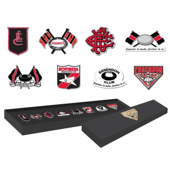
The old one is in this lot
I’d like a new one, specifically because the current one is now, in my mind, linked to our worst and most unfortunate era, on and off ground.
The pies change theirs all the time.
Shows you how much attention I give em
Our current logo reminds me of the anchor on the old green, red and purple Freo guernsey, weighing us down.
Yes could give it a go. Time for a change.