Adidas post 2010 drooping sash were great. Agree on puma. All round afl make the best gear.
2 Likes
I’d love some casual merch, tshirts, hoodies ect. I was expecting under armour to really come through with this but absolutely nothing.
2 Likes
huge disappointment, just a generic line of regurgitated wear across their teams, yawn
The design we have at the moment is complete ■■■■. These are my favourites, especially the late 90s one

1 Like
Not so worried about a black seam or red trim, just hate the clash jumpers. Prefer fat sash and red shorts.
![]() Horrible.
Horrible.
2 Likes
Fat sash, skinny sash, striped, not striped. Copy & paste the same comments each year.
The majority of you would not be happy unless the players were running around in woollen Nubrik tops. Which are always plentiful at the Bomber Shop because nobody buys them. There’s a reason no one buys them.
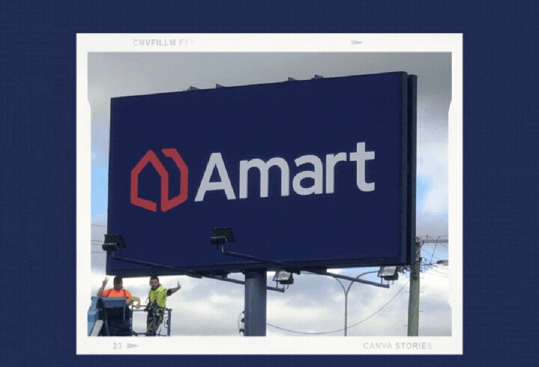
I do agree the Amart logo sucks, but the sponsor is not changing their logo to appease this forum.
3 Likes
Looks better than the Ariel bold in italics.
1 Like
Hey Amart marketing team - I know you’re reading this.
2 Likes
■■■■■■■ lol. They’ve rolled out a rebrand in January which would have been in the planning for months, maybe even a year.
But the jumpers rolled out only a little more than a month ago have the old Amart branding.
The communications and relationships between Essendon and its sponsors must be dire.
2 Likes
‘Surely’ they will change the jumpers before the season starts, but if you’d just paid top dollar for a new jumper with the old logo, I think you’d be entitled to be a little peeved.
A video on Amart’s LinkedIn page says they new logo was first shown in July last year.
Maybe we’re both cool with using the old logo, but I dunno, it all seems at odds with what was touted as the best ever sponsorship when announced in 2018.
1 Like
Would look a lot better on the jumper if the Amart writing was blue and the background white.
2 Likes
Went to the Bomber Shop today. Have to say the quality of the material for the UA stuff is very average. Especially the polos, it’s like this weird feeling fabric that really hugs your body, which IMO isn’t necessary. Very thin and flimsy feel to it. What also triggers me with just about every item in the UA apparel range is the EFC logo is a sewn on patch, yet the UA logo and sponsor logo are heat pressed on. I don’t understand that. I know people didn’t like ISC (I thought they were OK) but at least all their logos on hoodies, polos and track tops were embroidered. Feels far more permanent.
Got the track top, which is the only one I liked. Rest of it is very underwhelming, disappointing to say. The sooner we ditch UA for Puma, Nike or Adidas the better. I’d even take New Balance.
2 Likes
Related to the 150th anniversary logo change?
I don’t know, I noticed it with last year’s stuff. I got an UA polo from the 2020-21 range. All logos embroidered, material far more sturdy. Seems like a change from last season where they’ve gone the heat press sponsor logos. Feels cheap.
Even the AFLW stuff that was made by Cotton On, is better than the UA stuff. I’ll wait and see what the AFLW range is like this year before I purchase anything.
3 Likes
The UA stuff this year is beyond pitiful, somewhat likely we get no attention as they clearly couldn’t sell the 2022 stock with the loser 150 logo on it so are just spitting out whatever generic crud the contract minimum requires
And I’ll be one of those saying this forever but why cant the alt jersey be one of the brilliant red and black indigenous designs we’ve had permanently
2 Likes