Jon also calls himself that on his Instagram page which is why I said it
It’s not as interesting, perhaps, and looks a bit drowned/unhappy… but that old logo was truly awful.
new logo is very original and makes the club stand out from others


The new logo is heaps better than their old one.
I really like it. The format of the wording is bit retro, which I really like.
About time Essendon also changed its logo. Preferably back to the one from the 80s, which is still absolutely mint.
1 Like

gotta cash in while stranger things is still hot ■■■■.
1 Like
Both of our logos are awesome id say. The latest logo would be coming on 20 years old though now and it has aged extremely well. It still looks amazing.
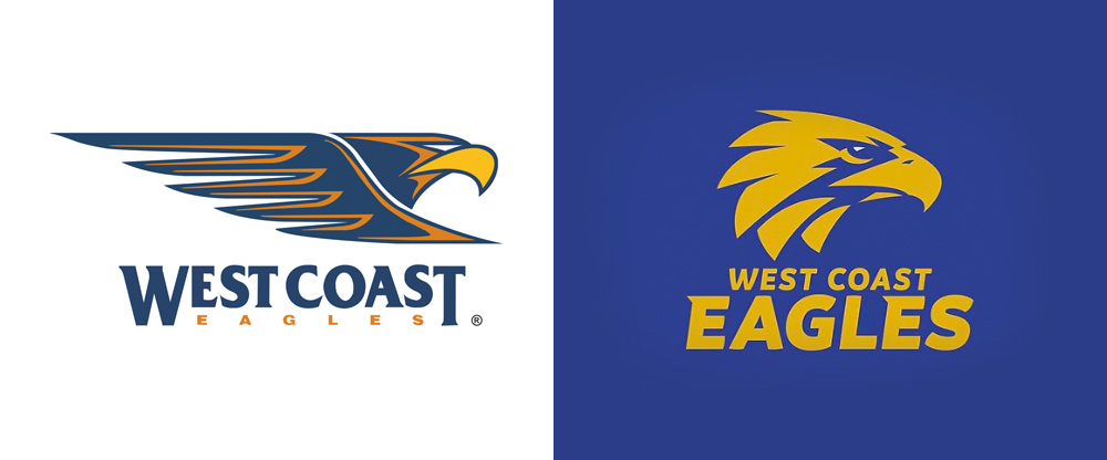
Which one is the new one?
There is an interest in other teams logos?
Seriously?

3 Likes
i for one vote kissy lips bomber.
Disgusting logo for a disgusting club
stop sitting on the fence wob! Tell us what you really think!
yeah nah s’alright i guess. i dunno
It appears Nic-Nat has ruptured his ACL in his right knee. Previously he had a knee reco on his left knee.
terrible news
1 Like
It looked a fairly innocuous incident at the time, l didn’t even notice it. Terrible luck for the big who was playing well. l never like to see an injury to a player, especially such a serious injury.