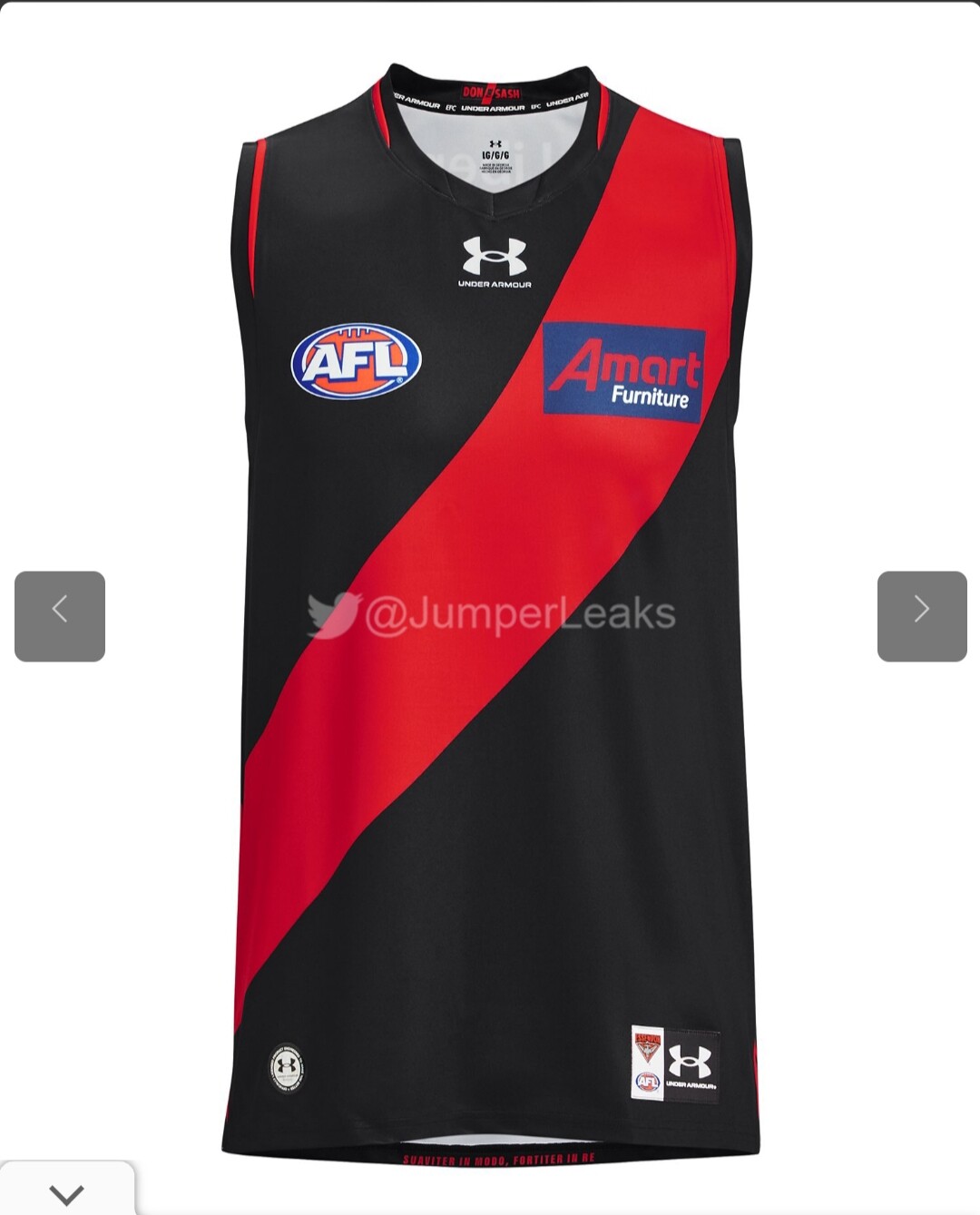
Not sure i have seen this posted anywhere. Here is a leaked version of next year’s jumper. It looks better than this year’s, but I’m still not sure about the red cuffing.

3 Likes
Until that Amart sponsorship goes I’m never going to be a fan of the jumper. I do like that they kept the red cuffing, think it looks good.
12 Likes
Why red cuffing on one arm and not both? Strange choice.
Edit: Maybe the sash prevents it.
4 Likes
Why red cuffing at all? It’s not necessary. (Maybe around the collar is OK, if that’s still called cuffing - maybe piping?)
Edit: Notice the back of the collar has a tiny red sash?
3 Likes
I thought we weren’t up to AMart standards anymore.
#bringbackthecollar
1 Like
Shithouse. The cuffing and the bright blue abomination on the sash.
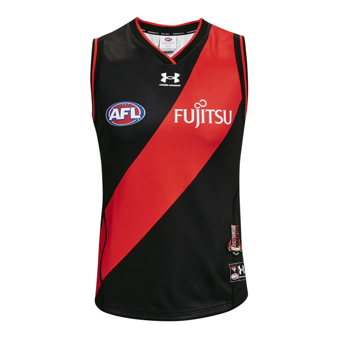
Just fk off the blue background with a single tone logo like Fujitsu.
Also that tiny bit of encroachment from the liberty logo is cringe and amateurish too
11 Likes
The black stitching doesn’t appear to be interfering with the bottom of the sash, so that for me makes this better than last season’s jumper.
2 Likes
Also… settle down Under Armour. 3 logos on the front of the jumper is a tad overkill.
I’d like to see the AFL logo removed but that’d never happen, however, I believe a club logo should go on the left hand side of each jumper, sponsor on the right and AFL above the number on the back.
3 Likes
I do prefer the look of a clean sash.
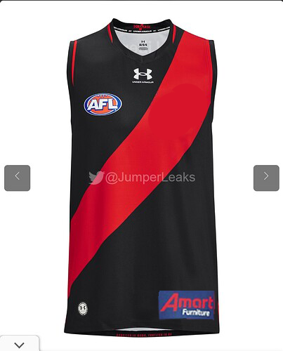
9 Likes
And then tuck the jumper into the shorts.
Hey presto, no Amart logo!
8 Likes
Yeah, I think it would be more legible that way anyway. I don’t think Amart are doing themselves any favours.
2 Likes
The Amart logo sucks and will always look terrible on our guernsey but otherwise, it’s all pretty good IMO.
Replace Amart with the Fujitsu logo in the first post and it’d look much better.
1 Like
Similar to the NIB logo on the Richmond jumper. Looks hideous!
We’ve all known the amart logo sucks, can’t wait to be rid of them. The one thing grinding my gears on this one, is the Liberty one on the back. Seems small but the fact the black background wasn’t removed and encroaches on the sash is a ■■■■■■ and tacky look.
3 Likes
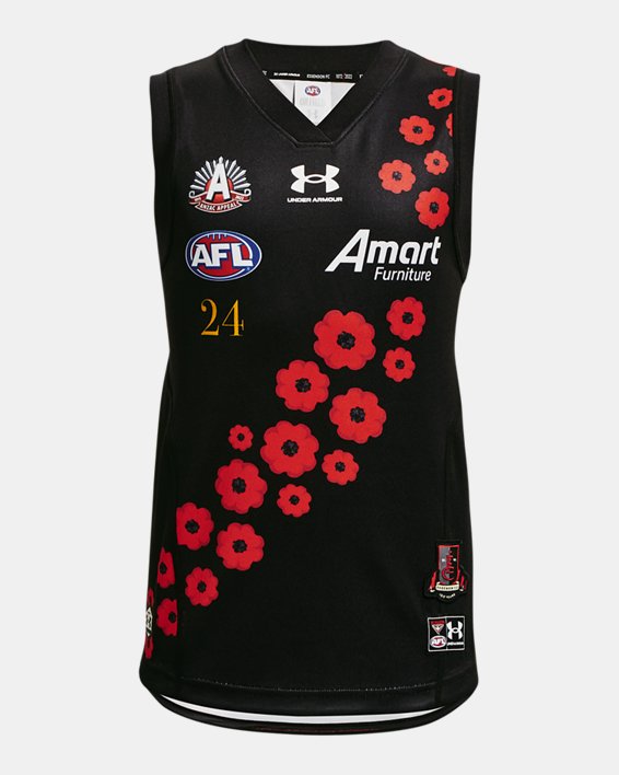
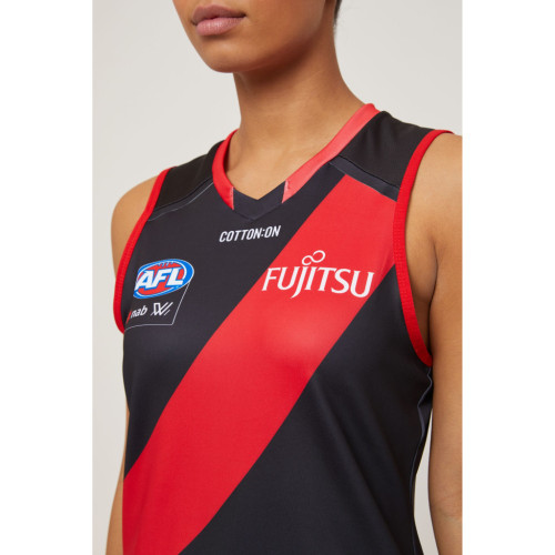
If they’re insisting on the red collar, I prefer what Cotton On has done with the AFLW guernsey. It looks much better IMO.
Ignore the broken sash. That looks awful.
1 Like
Yeah liberty higher off the sash and around the collar. Fujitsu lower, off the sash.
Year 4 students can colour within the lines ffs.
1 Like
Is the printing on the back of the jumper on the first pic in the thread about 3 degrees from the horizontal?
After that Photoshop effort I can’t look at any other pictures in the thread…
1 Like