Don’t be ridiculous, it’s clearly 4 degrees off horizontal.
1 Like
I want a return of red shorts, despite bltn jnr’s position that its a bad idea !
6 Likes
Really little ones
2 Likes
I have disliked the shade of black the club has been running with, ever since the AFL started printed jumpers on white based material, which has been a while. The current shade of black seems almost charcoal rather than a dark black. If you take a look at the following chart, i’d prefer a much darker #070707 , rather than a lighter shades.
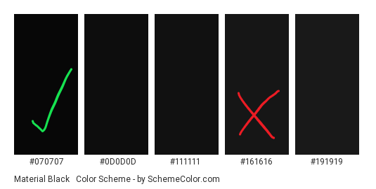
I suspect it’s just a question of additional costs, but given it is the club jumper, you’d want to get the shade right.
4 Likes
You sir, have vastly superior eyesight to me. All I see is ‘black’.
12 Likes
Fifty shades of black.
I actually really like the jumper.
Unfortunately, the Amart logo is sooo bad, it destroys anythings it’s on.
It’s like if you owned the Mona Lisa, and glued a giant rubber pen!s on the middle of her forehead. It’s still a beautiful piece of art… But, there is a giant rubber pen!s stuck to it.
I think I’ve made my point.
4 Likes
Searches for link to Craiyon…
4 Likes
I like the idea of red shorts as a “soft” away jumper for games where we can get away with wearing the home guernsey but use the red instead of white for the shorts. Would never want them for home games though.
3 Likes
Yep. Red socks with a very small black hoop would further make it easy to distinguish.
2 Likes
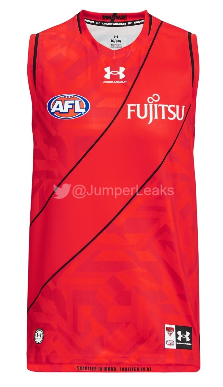
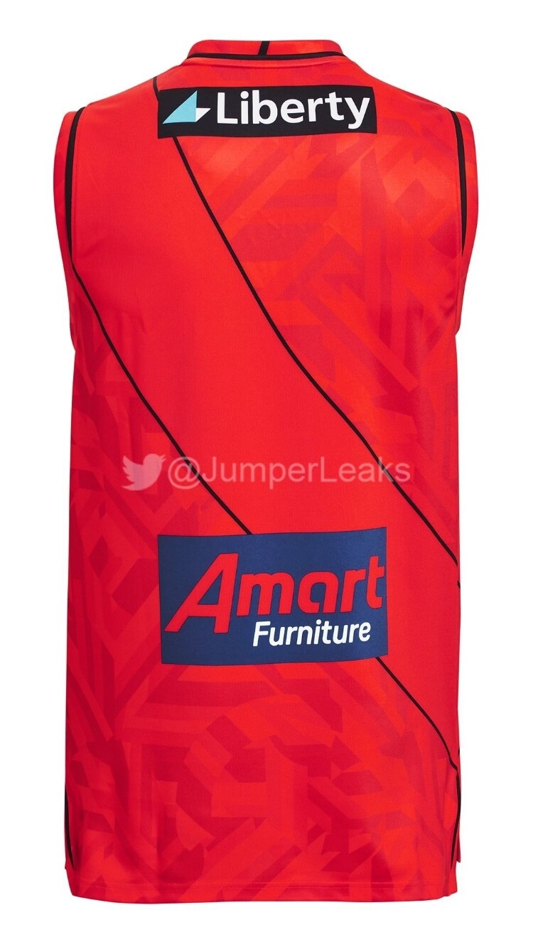
The guernsey will never look good with any sponsorship logos that aren’t of a black/red/white colour scheme. That said, there are so many issues I have with this jumper…
- I agree with @Vanderlegend on the shade of black needing to be darker.
- The use of red cuffing on one arm and not the other looks amateurish.
- All logos towards the bottom of the jumper look overcrowded and cheap.
- The Liberty logo cutting into the sash is something you’d expect in junior footy and I’m not even sure Liberty would be happy with it.
- This one isn’t the club’s call but I’d can the AFL logo and move the Under Armour logo there instead. Two logos in the upper third is plenty.
4 Likes
It’s not really that. It’s the fact that the cuffing is on the inside of the cuff, and is red in colour, therefore it blends in with the sash. But yeah agree with everything you’ve said. It’s what happens when you let some graphic design/marketing ■■■■ loose and have zero feel for what the jumper should look like.
Also, there are small bits of red piping on the sides at the bottom of the jumper where it looks like there are “vees” cut into the side stitches. What’s that all about?
We have a great colours on our jumper. Don’t over complicate with random red trims.
But I guess some douche exec has it on their kpi so we have to junk it up with their ideas.
Save some time and money and just go with a simple black with a red sash.
3 Likes
It’s going to get to the levels of EPL shirts where they will make some changes to the jumpers year to year so that fans think “I have to have the latest jumper”. Everyone knows that the Liverpool home shirt is red, yet every season there will be different detailing, etc that distinguishes the new shirt to its predecessor. And of course the away kits change. For me I’m turning 40 next year so the days of me buying jumpers and wearing them to games is probably over. I’m more interested in the polos, hoodies, track tops, jackets, etc.
2 Likes
Here are the clash jumpers. I’m one of the few that has liked our recent clash jumper, looks like they have put some patterning outside the sash this time.
Doesn’t look great, but i usually wait to see what it looks like ‘on field’ before making a judgment.
I reckon the jumper would look a whole lot better if we won more games.
25 Likes
When it comes to a clash jumper, I still don’t get why we can do what Richmond does. Just reverse the colours. Black sash on red.
4 Likes
Maybe because the constitution says the jumper must have a red sash on black?
4 Likes
Why can Richmond do it??