It is actually there on both sides if you look closely, but there is no contrast against the red sash.
1 Like
That’s savage!!!
Yeah so why do sponsor logos go over the sash? It has to be straight up red sash.
1 Like
1 of my faves above.
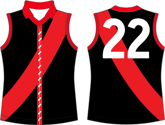
Thin sash vs fat sash
Droopy sash vs straight sash
We should wear them when away to Collingwood and FC.
1 Like
I am against the use of red shorts. They looked bad back then, they won’t look any better now.
3 Likes
@efchirdy05 Have you seen a more pathetic effort? Under Armour has really dropped the ball. The on-field kit is atrocious.
1 Like
looks the same as last year. meh
I guess I should have an opinion. Looks ok to me. Get rid of arm cuffing, make under armour logo smaller, make Amart logo smaller (to balance the AFL one) and I’d be happy
I think it’s logical that we wear red instead of white shorts against teams like Collingwood. White is literally one of Collingwood’s two colours, it makes no sense to me that we should be wearing black or white shorts against a black and white jumper.
3 Likes
Imagine the motivation for Stringer and Tippa to NOT let their skinfolds blow out, in the knowledge that red is hardly a flattering colour for someone packing extra at the rear.
Bring them back for select AWAY games i say.
1 Like
Too much sash droopage
I prefer it to the straight sash.
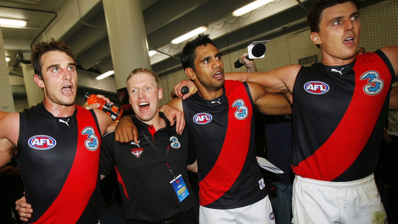
Recently Puma are by far the best brand of footy jumpers across all clubs.
6 Likes
I remember when they took over from BLK at Richmond. Their take on the jumper was a huge improvement and was warmly received by supporters. Puma’s also nailed the strip for GWS, North, and Carlton in recent times too.
2 Likes
Red shorts please.
2 Likes
Yeah I’m okay with red shorts. Especially with the red guernsey against St Kilda.
Under Armour jumpers are ■■■■.
3 Likes