Thanks Mero. That looks good. COMPLETELY eliminates clash with Port/Richmond if there even was one. Especially with the wide red on the socks (top black hoop can be thinner too). Saints is mostly gone, would be good to see a real mockup. Jeez it’s a shame we can’t just do that.
I’ve had enough of this clash jumper already. I knew we’d perform like we were wearing the Grey Strip.
Give us a proper sash please I do not like that jumper.Can you wait 11 months?
You’re working with ISC?
Rad.
As said on the podcast, tradition is dead so we should go spaz on the clash jumper. I want a fluro yellow kit with a red sash.
I head that, and hoped you would give my baby a mention

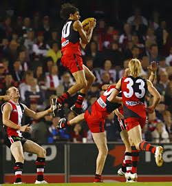
It’s the “Moorcroft’s speccy is still the best mark this Century” jumper
Next year will look something like these:


^^^Perfect!!! Absolute perfect look if it does.
(Mero, on that away jumper above, could you please do your thing & blacken the tiny names in the jumper body, so we can see how that looks?.. Should help lift the sash out more, and hopefully still look red or light enough for the AwFuL to accept) Thx
An evil part of me would have liked Essendon to have worn Port’s original jumper.
Give us a proper sash please I do not like that jumper.Can you wait 11 months?
You’re working with ISC?
Rad.
As said on the podcast, tradition is dead so we should go spaz on the clash jumper. I want a fluro yellow kit with a red sash.
I head that, and hoped you would give my baby a mention
It’s the “Moorcroft’s speccy is still the best mark this Century” jumper
Those socks need to be orange ffs…
The droop… it’s coming back…
Thanks for the heads up @ Mero
It’s a sash. How hard can it be? Pick a design and stick to it for fark’s sake.
Next year will look something like these:
If this is the gurnsey next year ill be wrapped!!! Absolutly perfect sash and what it should be every year!!!
How is it different to this year? And can’t we have a straight sash?
Bring back the stripe! #sashbollocksclashbullshit
Plz no droop =[
Sash too wide for me…
The candy cane jumper looks prettier but it does not look like us (maybe if the broadcast was in HD the detail would show better).
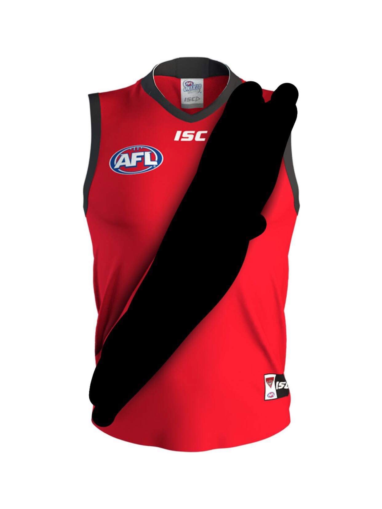
Any chance our clash strip can look like this.
Do away with traditionalists with the red sash.
And have a nice clash guernsey.
1 Like
Makes no sense at all.
Those two statements are completely diametrically opposed.
Also, Nup. Never.
Red shorts
Problem solved.
4 Likes
The fat bum strip
There was nothing wrong with that, until the AFL classified red as a dark colour, and then they didn’t.
1 Like