I like the way FarkCarlton is honouring their tradition of fat forwards.
Whitnall McClure Fevola etc etc.
1 Like
Many Essendon sports teams also use the current logo such as the Essendon Hockey Club, Essendon Rowing Club etc.
 I like that I have Nino on ignore and therefore can’t see his suggestion but based on his hysterical posting I’m happy about that
1 Like
I have a problem that the F-16XL lost a competition to the Strike Eagle
2 Likes
It’s the stupid swing wing thing, and that’s the stylised intakes, but all those types have some sort of leading edge extension to smooth that transition.
Still, swing wings are so 70s.
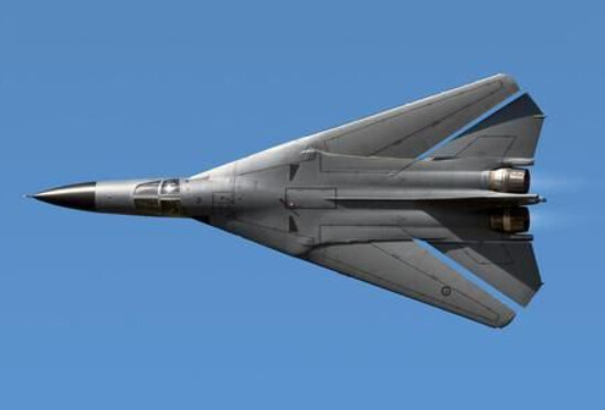
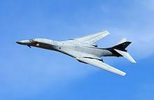
I initially thought the swing wings were an F-111 thing, but on further reflection it’s obviously a B1B
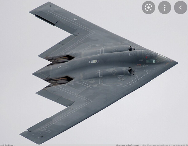
I’m not sure I’d really want to go to a B2, a Beaufort would be hard to put in a modern logo, and the RAAF doesn’t actually have a “bomber” in its current fleet.
2 Likes
Agree that the intakes are supposed to be there but there’s nowhere for the air to go in!
I feel like it’s a bit of a mash up of the F111 and the B2.
Not that I want to get too into it but I’ve been looking at this crappy logo for 20+ years waiting for it to change. How did they they make the B2 look uncool?
Anyway Nino’s right (at least partially).
1 Like
more blitz kissy lips logo
B1B I reckon
2 Likes
Not sure if it’s technically a bomber but the A10 Thunderbolt has always been the most intimidating looking bomber type plane for mine.
Just looks type a fkg tank. The type of plane that you see coming a mile away and just know it’s going to tear ■■■■ apart.

1 Like
Strike aircraft, so not a bomber, but that gun in brutal…
1 Like
17 Likes
Perspective eh?
To me, the nose is pointed down…there’s no other element within the logo to suggest otherwise.
But I’m happy to agree to disagree 
yeh I have no knowledge of bomber planes whatsoever
1 Like
I get what you’re saying, but I’m just saying what it’s supposed to represent.
Anyway, we might as well wait until the PC police make us change our nickname before we change the logo… 
2 Likes
Ha, I think you found the exact image the graphic designers started from!! If you trace that image the weird intake/pivot sections are pretty much exactly the same.
2 Likes
Always thought the B1 was a slightly odd choice, since it’s only used by US Airforce,
F/A 18F Super Hornet has a pretty silhouette:

But please let’s not use F35 (it’s got Essington written all over it)
1 Like
It is also ugly as sin.
However for everyone suggesting F-15s, F-16s, F/A-18s etc, these are fighter aircraft with secondary strike capability, not bombers.
It would be like the Hawks using an Eagle in their logo - close, but incorrect.
Let’s go old school and use the most visually pleasing of all ww2 bombers, the mosquito.

6 Likes
Skeeta!
2 Likes
I think our logo is now the oldest in the league by some margin (possibly along with St.Kilda’s).
Obviously it shouldn’t be americanised like the OP suggests but I think we should definitely replace it ASAP.
Be careful what you wish for, as some of the other clubs’ logos are abominations, e.g. Adelaide and Melbourne. (and some of the other short-lived sheisse that clubs have gone with since we’ve had our current logo.)
2 Likes