I like their top. I actually thought this years Dreamtime jumper was pretty good.
I dont like UA, but that looks decent
That’s not their clash jumper though is it? It just says away, so good chance they will be wearing it for all away games where they don’t clash. Basically to generate more sales, I mean good on them it’s a great idea, but I wouldn’t want us wearing a different top for all our away games.
They will still likely have the blue one they currently use, because that top doesn’t fix any perceived clash, not that they have many.
Best its looked for some time. I hate it when sponsors colours clash with the jumper. The navy blue on the Amart patch looked crap.
8 Likes
It’s not Harley Reid
3 Likes
No effing Amart!
I’m not suggesting we start wearing an away jumper instead of a clash jumper. I would hate that.
But to give our clash jumper some meaning and make it look good we could have given it an indigenous design and been a leader in wearing an indigenous design in more than just the indigenous weeks.
But it looks like we’ll still have a ■■■■ clash jumper and Gold Coast are first off the mark as frequent indigenous jumper wearers.
Have to say I rather like the 2021 indigenous round jumper - I could go for that as a clash jumper.
(with red shorts, obs.)
2 Likes
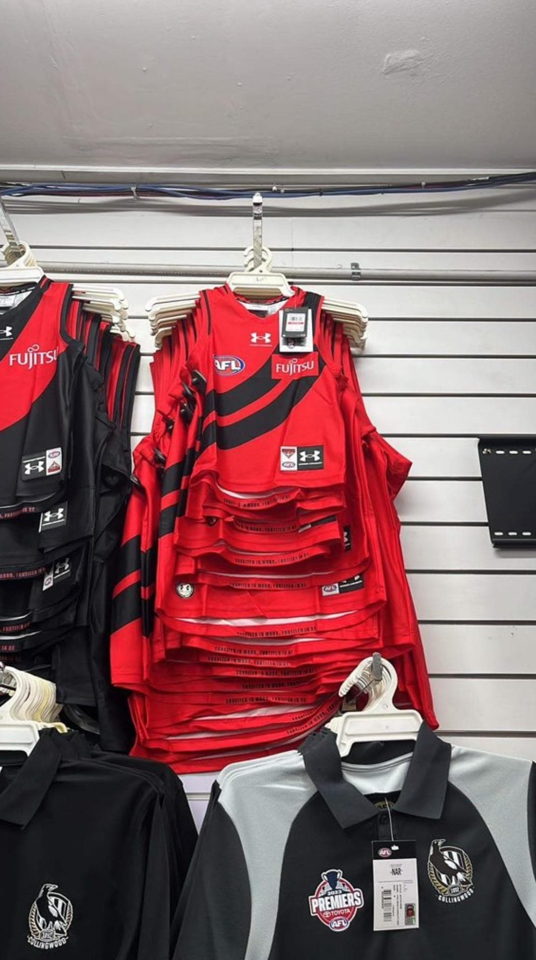
I’ll bite - the Fujitsu logo is off centre. There’s an alignment issue.
3 Likes
I’m disappointed there’s nothing to complain about. Too much effort perfecting the jumper. Should be focusing on winning games of football. Start winning and the sash droop takes care of itself.
4 Likes
Introduce a proper collar again and I’ll get excited. But the removal of the red trim around the neck and sleeves is welcome for me. It’s a simple jumper design that shouldn’t be ■■■■■■ with IMO…
2 Likes
Hmmm… Not sure if I like it or not.
1 Like
It’s a no from me
Edit: and they both look like they have the trim… Fk that
1 Like
Well, all the crying in here for insisting on the keeping the red sash as per the constitution. ![]()
![]() Be careful what you wish for.
Be careful what you wish for. ![]()
![]()
![]()
For the record, it’s not that nice is it? But, suits a purpose I guess.
1 Like
WTf
Red shorts
You know what I miss - the 2018 jumper.
1 Like
The droop is getting so low, it’s becoming a half circle cookie cutter
That the children gurneys are out of reach above the filth gurneys , so they may have to actually touch the filth to get our ■■■■ designed ones.
That’s ■■■■■■■ rubbish
And slapping that red box on there for the sponsors logo makes it even worse
1 Like