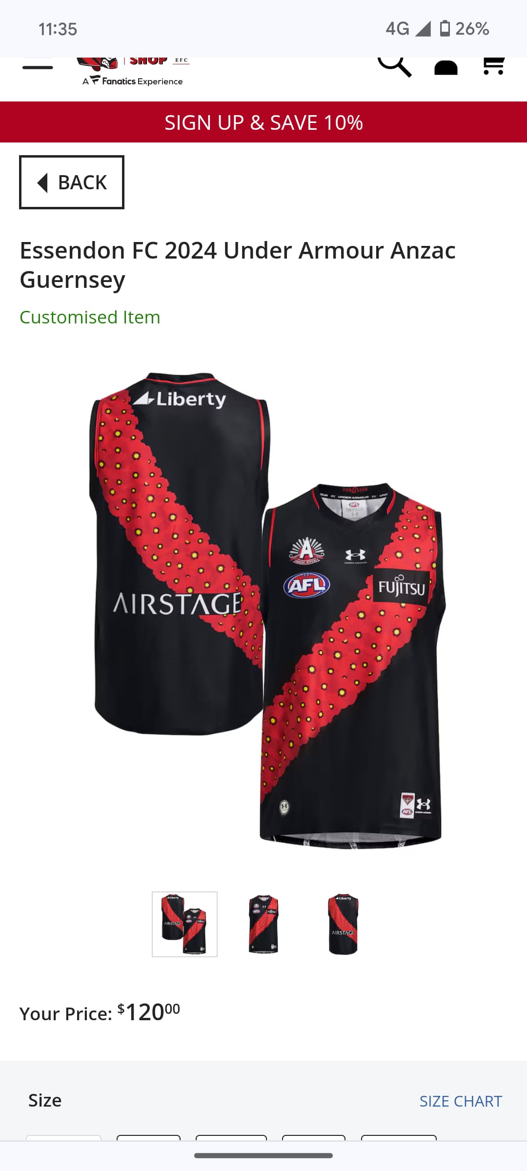
Whoever at the club approved this deserves a please explain. Hideous. The worst design yet. The poppy sash looks like a line of acne.
8 Likes
Looks like the sash has been infected by some kind of virus. Which is probably appropriate
12 Likes
Poppys as the sash is such a simple design, I don’t know how they’ve managed to make it look that odd.
They need to talk to the Melbourne jumper designers. Their ANZAC eve jumpers generally look great.
1 Like
More ■■■■■ from under armour.
2 Likes

I don’t know… it has a fair bit of yellow in it, as does the team.
3 Likes
Why did we change the poppys they were great before
4 Likes
RRRAAAACCCCCCIIISSSTTTTT
1 Like
Speaking of AFL Guernseys, I noticed during gather round that GWS & Freo had an incredible amount of black on their kits, which I found a tad displeasing even though they looked great. I’d like to think these teams and Port should be restricted on the % amount of black they can use. I swear Port seem to use less Teal as each season goes by. Gee I hate Port. I wonder whether The Pies or Tigers would care to pursue this matter? Isn’t it some form of encroachment on team branding? Any thoughts?
2 Likes
Maybe we got intel that Nick Daicos has trypophobia, cos that’s the only explanation for that alien anzac Guernsey.
(Trypophobia is an aversion or repulsion to objects like honeycombs and sponges that have repetitive patterns or clusters of small holes. I had a work colleague with this - she would absolutely not be able to look directly at that jumper.)
Surely this isn’t for real? They cannot possibly wear that. We are asking to be mocked
Port are the real magpies.
At least FUJITSU doesn’t take up that much space.
1 Like
Aside from the ANZAC logo itself, there’s not a single element of that guernsey that I could point to and say “wow, that’s nice”. From the pimple poppies, to the slapdash integration of the sponsor logos, to the red piping on the collar/sleeve. It’s a shocker on every level.
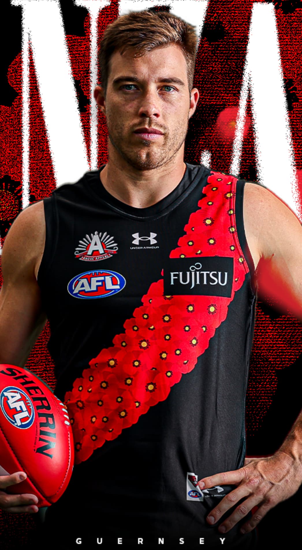
The boy ![]()
![]()
![]() Are the ■■■■ spots for taking the ■■■■?
Are the ■■■■ spots for taking the ■■■■?
1 Like
A myth perpetuated by Port fans and factually incorrect.
Collingwood had black and white stripes since their formation in 1897 and were known as the Magpies soon after.
Port wore a number of different coloured guernseys from formation in 1870 for the first 30 or so years. They were light blue and white and then pink and then magenta and blue. They had trouble procuring the magenta and blue dye at one stage so “swapped” to black and white in 1902. Up to then they were known as the Seasiders and Cockledivers amongst other names and didn’t take on the Magpie name and logo for a few years after that
2 Likes
Righto, Finlayson.
8 Likes
1892 actually.
Still the youngest of the old VFL teams though.