Why do we do these things
2 Likes
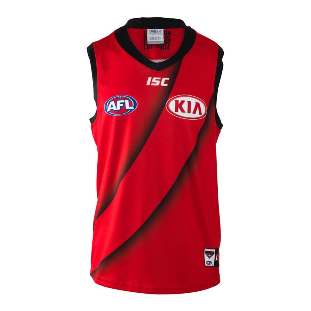
Drop shadow!
5 Likes
The red background is lots better than the grey!
1 Like
Awesome thread. Will read again
2 Likes
Not droopy enough. Delist.
I think the names of all the people whose ar.se we’ve licked over the years should be superimposed on the jumper in black.
2 Likes
I actually like it.
5 Likes
Show us Freo’s
Don’t, please…
Jesus Christ are we talking about the stadium Guernsey with WWE downlights on it?!
1 Like
Extra crispy sash. Looks like it’s burnt on. I like it.
Is good, they’ve done what they can to preserve as many original elements of the jumper as they can by sticking to the clash jumper rules, but it’s also good that it’s a bit ■■■■ because it shows about as mush respect that AFL mandated clash jumpers deserve.
It’s now a ‘clash jumper’, not a heritage jumper.
Good. Call a spade a ■■■■■■■ spade.
Still wouldn’t mind us with red shorts and more red in the socks with this from time to time.
1 Like
It keeps our colours, too. We can thank Mark Evans for that.
WTF
Why are we calling it a clash guernsey not a heritage guernsey? I loved the refusal to call it clash.
Have we just ditched the champions of Essendon theme? I liked that.
Still think with a simple mannequin presentation or photoshop (or photoshoot!) we could easily demonstrate that red shirts, red socks (w/pinstripe black) does the job of distinguishing us (and if we must, a slightly thicker sash.)
It’s fkn ridiculous but I’m preaching to the converted.
1 Like
NO.
FAT.
RED.
SASH.
EVER.
AGAIN.
2 Likes
Surely it’s ten times better and a million times more faithful than this?