Pretty impressive year from someone I wouldn’t recognize walking down the street
Just looked at this. Model is broken completely for Essendon players given last year.
I know right, got 30 disposals 15 times or something.
1 Like
TrevorBix provides the best content.
1 Like
Humble pie post, our model had a little error in it.
I decided to do a little unpacking of Richmond’s game plan, based on my own observations and a teensy bit of data.
Grant Thomas seems to have echoed a general consensus in his comment that the Richmond team was an ‘unskilled’ one and that the win, like last year’s Bulldog victory, showed that ‘intensity’, ‘hardwork’ and all those good football cliches can turn pretenders into contenders. I’m very skeptical of such thinking. The idea that one team is more motivated or harder working than others might hold weight for a random H&A encounter (sometimes teams just don’t seem to ‘turn up’), but I can’t accept there’d be a noticeable difference on this score across three finals encounters.
So what is the Tigers game plan? It’s my observation that over the last 10 years football has become about the press, both setting one up effectively and breaking through the opposition (Clarkson’s 2008 “cluster” was the first time I really began to notice this live, though no doubt the trend was well on the way from various teams). The Tigers, like the Bulldogs, give their press extra teeth by running a smaller, makeshift forward line that allows them additional midfield rotations (the Bulldogs in particular valued this) and greater pressure on the opposition HBFers, thus stopping a crucial source of counter-play and reducing the oppositions ability to ‘beat the press’. This game plan can be broadly categorised as “defensive”. According to TheSquiggle they are the 3rd weakest offensive team to have won a premiership in the AFL era (ahead of the the WB 2016 and Swans 2005), but are the 2nd best defensive unit to have won a flag (narrowly edging the 2012 Swans but behind their 2005 model). So what does this look like statistically? I had a look at their three finals games.
I expected to see that they dominated three key areas - Clearances, Contested Possessions, Tackles and i50s. I expected a deficiency in Uncontested Possessions. That’s simply what it looked like to me, watching these games live (I haven’t re-watched them, life’s too short).
The first thing that jumps out is the GWS game. They lost basically every statistic. Leon Cameron copped some flack for his coaching but I strongly suspect it was injuries (Cameron out, Lobb forced to ruck) and poor selection (Stevie J was cooked) that reduced their forward line to a shambles, they managed only 67 points from 59 I50s.
In the other two games we notice a few things, they had strong wins some areas across the Qualifying Final and Grand Final: Contested Possessions, +19 and +30, inside 50s +19 and +9, they also had far fewer Uncontested Possessions -28 and -47.
What is interesting is that they lost the tackle count in both (only just, -2 and -3), however they were able to force all three sides into significantly higher clanger counts (Geelong +8, GWS +14, Adelaide +8). This, perhaps, is the mark of an effective press. It’s not the tackles themselves (takes more than just hard work!) but the combination of tackling pressure and effective up the ground set ups.
I decided to compare it to the Bulldogs run last year. The Bulldogs lost the tackle count every game (by an incredible 43!! to the Hawks), but had fewer clangers in every single game (they also had 12 more free kicks than the Swans, jeezus can you imagine Blitz if that happened to us). Interestingly they had higher Uncontested Possession counts than Richmond, indicating they moved the ball less directly than the Tigers.
Now, the obvious question is simply perhaps “don’t good teams just make fewer mistakes?” so I unpacked that a little further. I decided to look at Geelong in 2011 as an example of a wonderful attacking team, they racked up more clangers than their opponents in 2 finals (1 tied) but also dominated the I50 count, indicating a more ‘high risk’ game plan. I also looked at Essendon 2000 (because, hey, why not!) and we had a higher clanger count in 2 of the 3 finals (12 more vs North, lol).
Now obviously, these are majorly small sample sizes but I do think it’s interesting that two very defensive teams have won back to back flags, when the historical trend has been that offense generally carries the day (as DJR would say, LOL Ross Lyon).
All data taken from afltables.com - as the samples were quite small I didn’t bother compiling it in a very thorough fashion, it’s easy enough for people to look up on their own.
14 Likes
Nice post, man.
On the above - I would hazard that they are linked and related.
2 Likes
Great work and interesting analysis
A few bugs but the new HurlingPeoplenow website at www.hpnfooty.com is AMAZING
The good people at hpnfooty.com have devised a really interesting ratings system called Player Approximate Value (PAV). The formulas are WAY too long to describe here, but it attempts to approximate the total contribution to a team that a player provides in the three key areas of the game, defense, attack and the midfield. More info here: http://www.hpnfooty.com/?page_id=22672
The cool thing about it is that they’ve backdated player ratings several decades, to create a genuine database on which to compare and analyse players seasons. I’ve been playing around with it for the lulz, and it passes the ‘eye test’ really well. That is, it throws up results that seem sensible, and most importantly, interesting.
For fun I decided to compare the Crichton Medal result to the PAV ranking system for 2017.
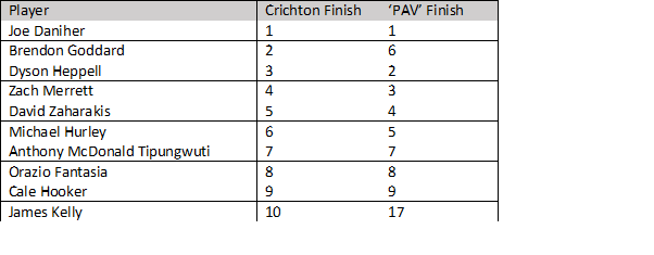
For the record, Watson was 10th according to PAV.
In short, PAV did a much better job of predicting the Crichton than Bomberblitz did.
Why is this interesting?
A few thoughts on PAV as a tool for analysis (pros and cons)
- It’s the only system of ‘rating’ a player, that I’ve seen, that does a decent job of comparing midfielders and forwards on a combined scale. Daniher was definitely our best player this year, this is the rare statistical system that captures that.
- Lock down players and defenders are still undervalued, because only Champion Data has the ability to compare how much a player reduced the impact of another. I attribute Goddard and Kelly being slightly underappreciated to this fact.
- It rates contribution across the season, meaning players who missed games have lower PAV scores. In context, Hird’s best PAV season was 1996 when he was valued as the 2nd most valuable player in the league behind Carey.
- Ruckmen do surprisingly well. It rated Ryder’s as our best player in the 2014 season. In hind sight, I suspect it was correct.
- It’s a fresh perspective beyond tired ‘possession count’ type statistics.
Have a dig around on the off season!
13 Likes
Interesting post! WRT this statement, can you show BB’s rankings please?
Also how many decades does it go back?
The Crichton medal results perhaps weren’t the best example to show the usefulness of PAV. While this year it’s results were freakishly on point, that’s not the case for every previous year and it’s a little unfair to expect them to be. What I was trying to establish was that PAV passes ‘the eye test’ much better than most statistical valuing tools.
The Eye Test
For us to trust a statistical measure it has to correlate somewhat with our perceptions of what is going on in a game. The only publicly available measures similar to PAV are AFL Ppoints, Fantasy Points, and Supercoach points. Unfortunately the latter two flunk the eye test badly, and the player points are bound by position heavily. For instance if we look at Supercoach points as a measure of player value, it rates Danger and Dusty as the two best players in the league, but throws up Tom Mitchell and Docherty as number three and four. This doesn’t sit well with us as fans and people, as a result, scoff at SC points as a measure of value and aren’t really willing to engage with any insights they might offer. In contrast, PAV rates Mitchell as the 21st most valuable player of 2017, and Docherty the 48th. To me that feels about right which is fairly impressive in and of itself.
So beyond crude ‘rankings’ (which given it’s approximate value, is not really the point) , why use PAV? I think it gives us really interesting ways to look at players.
It looks beyond a player’s core attribute

These are the top offensive player of 2017 according to PAV. If we compare to Daniher to Brown and Kennedy, we note that Daniher scores higher than both despite fewer goals than Kennedy. This is because PAV values other actions (such as i50s, and goal assists). But the real point of difference is there overall score. Daniher’s overall PAV score is roughly 33% higher than Kennedy’s, and quite a bit higher than Brown’s as well. The reason? PAV factors in Daniher’s efforts in the midfield as well. This allows PAV to rank (correctly in my opinion) Franklin and Daniher as significantly more valuable than the other key forwards in the league.
This approach provides a new perspective on some players
If we look at PAV’s top 5 for 2017, it looks pretty spot on:
- Dangerfield
- Martin
- Sloane
- FRANKLIN!
- Zorko
People always quibble with such lists, but I reckon that’s better than the Brownlow or Supercoach. But at #6 things get interesting: Matthew Kreuzer. Wat.
At this point, we can either chuck out the rating system or take a good luck at Kreuzer’s 2017. Turns out it’s pretty good, due largely to what an effective all round player he is. His Mid Score is the 20th highest in the league - using conventional stats this seems a pretty fair estimation given his hit outs and 4.5 clearances per game average. However, his offensive score is also very high - and he also picks up some crucial points in defense (possibly from intercept marks, clunking from kick ins and rebound 50s).
The overall Kreuzer package then is a uniquely valuable player who impacts across the ground. Again the point isn’t whether or not Kreuzer really was the 6th best player of 2017, but it’s clear he is probably a little underrated (possibly because of his versatility).
I did a quick run through to find an Essendon player with a similarly ‘weirdly even’ contribution, and found that in 1999 Darren Bewick was rated the league’s 30th most valuable player on the back of an incredibly even spread of contribution (his defensive score that year was higher than his offensive!).
To answer you Q Thurgood, it runs back to 1988, but at some point (I think around 1998?) it becomes a little shakier as certain key statistics were not yet collected so substitutions had to be made. Still fun to play with tho (turns out Jim Stynes’ 1991 season was REALLY fking good).
7 Likes
Really interesting stuff. Hopefully, it will effect the kind of perception we have of players’ worth in general, and it carries over to mainstream.
On another note, I thought it was fairly well known that club awards are not really great indicators of the overall performance of a player. In the industry, I understand, they are generally looked on as being effected by other influences. Could I have been any vaguer with that…
Thanks BBB. I had a look at this when they first put it out, and had some concerns. But right now I can’t remember what they were. Going to have to go back and read in detail again.
This stuff is really interesting, and it will only get more so as the models keep improving.
Should have played on…
Should not have played on… but O.M.G I soooo wanted him to.
1 Like
From the AFLPA site, regarding GPS data. For stats nerds only.
GPS data captured through devices worn by AFL players was shared with broadcasters and licensees (Champion Data) on an ongoing basis this season for the first time through changes in the new CBA.
This includes identified individual (top five only) and team metrics such as distance covered and maximum and average speed. GPS data has now joined statistics, highlights and opinion in the analysis of players, teams and AFL games. But given broadcasters and media outlets have only commenced using GPS data under this new agreement since week one of the AFL finals, it remains to be seen how it will contribute to the conversation.
Geelong was criticised for its work rate in the first week of the finals after its 22 players combined for the least distance covered of the eight teams, but how strong is the correlation between distance and desire?
AFLPlayers.com.au editor Simon Legg sat down with a high performance manager from an AFL club to learn more about the application of GPS data ‘inside the four walls’.
How do clubs analyse GPS data from a team perspective?
We don’t look at global volume on a team level. We do it more on an individual level and we don’t look at it as a performance-based thing or a performance-outcome thing. It’s just how you work that day because of the position you played on that particular day. So if we have run a lot in a game, then I’ll be looking at what we need to do that week from a load perspective. We might have certain players that are doing a tagging role, so for instance, our negating midfielder or best runner goes to a player like Tom Scully, and we know that Scully won’t come off in the second half, so we’re going to put our best runner on him because we know he can run with him. We may then manage his load at training during the week depending on who he is playing on or the specific role he needs to play. So that analysis is not actually done on a team level, it’s all individual.
And from an individual perspective, how do you view that? How does it change from a negating midfielder, to a defender and so on…?
It depends on the makeup of your team, because ideally you want to manage energy as best you can. We might need our best rebounder to play a whole quarter because he’s just intercepting everything and rebounding. So therefore on an individual level, we see that he has played all of the second half, and he is a high-level running player with high speed. It’s all about trying to get them back to the most normal level you can based on the output they have provided. That half-back might have 35 touches and run 12 km, which has happened this year, but he might also run 15.5 km and not go near it as much, so everyone thinks he hasn’t played as well but he has run his backside off so no one cares. But when he runs less the week before and has a strong game, his running patterns and distance covered is overlooked. It can be misconstrued in that way, because touches don’t equal effort.
That’s a good point, because if a team loses and someone runs one or 2 km less than the week before, that’s when the stories start to come out…
You’re probably far enough across it in terms of your understanding of what GPS provides us, but if you’re getting beaten by 30 points, and you are sort of within a sniff but you’re not really going to claw it back, most teams that are losing are running more and most teams that are winning are running less. It’s very common across all team sports that if you’re losing, you’re running more. I’d love for every player in our team to move the ball so well that everyone runs 10 km because by the end of the season they have played two games less than everyone else.
Do the KPIs differ from a half-back, to a midfielder or ruck?
It’s not so much a target that we’re trying to hit, everyone has a profile that they run. If there are players that are significantly under or significantly over what they normally produce, we’ll talk to them about the reasons why. A gun midfielder may not have slept well because his son was sick, or perhaps someone’s diet has changed throughout the week. We’ll consider what we can tweak to help them be more consistent.
Also, if the player is significantly under, how did they play? One of our mids ran about about 12 km and had 40 touches in the wet and that was his best game of the year, but it was just about his lowest running game of the year. But he’ll have games where he runs 14.5 km but doesn’t get a sniff.
Obviously, we have individual profiles for their positions, but it’s not a strict KPI where they have to run a certain distance by three quarter time. We don’t fill their head with that sort of stuff during games because it is irrelevant. A player sticking their head over the ball and getting the pill when it needs to be won is more important than jogging fast enough when we didn’t have the ball and you’re in the back 50.
There’s so many different ways that GPS data can be read because when you look at the tactical role they’re playing, there’s a reason why a half-back isn’t running as much in a game because he is the plus-one in a quarter.
We need to be really careful with how we comment on the numbers and shy away from just assuming that less miles travelled means a player is being lazy. I guarantee he won’t be called lazy if he gets five intercept marks and six rebound 50s. When our midfielders play inside, their acceleration, high speed running and metres gained drops off completely as opposed to when they are on the wing or across half-back.
When it comes to the high-end speed and those running numbers, which position is more likely to record a higher end speed?
You’ve got special midfielders like Tom Scully and Marc Murphy that have got this ability to run at a high speed while playing inside, but position wise, you find that back flankers and wingers run at the highest speed because they’re not in as much traffic. There’s a difference between if the game is coming at you, or you’re running at the game.
In your role, if you’re seeing that the team hasn’t covered that much distance defensively, is that sometimes a good thing because it might mean that your field positioning is strong and you’re repelling a lot?
Absolutely. If we have a really poor set up, what will happen is we do a lot of high speed running and we’re gassed really quickly because all we’re doing is chasing. If the opposition isn’t scoring off us doing not a lot of work, that’s great because it means we’re well positioned and we’re conserving energy.
Talk to me about how you calculate training loads based on an individual’s game, like with the earlier example of a game where they have hardly had a break…
We have a lot of different methods in place like physical screening and longitudinal data across the season and the pre-season — we know what guys can tolerate. It doesn’t then mean that we will definitely pull someone back at training the next week, because if he doesn’t need it then he doesn’t need it. But if he is running around with Andrew Gaff the week before and has run 15.5 km then a physical toll starts to accumulate and we’ll act accordingly. We have databases that are strong enough to let us know that if someone’s base line measure is 16 km and he runs four games in a row at that level then I’m not worried, whereas if a younger guy who isn’t at that level does it, you would have alarm bells ringing. Everyone is different and that will determine what we do at training.
The crux of it is that GPS for us is more of a load monitoring tool than a performance tool. I’m not going to make any decision on a game based on the GPS numbers on game day, at all. My job is to make sure that if a player is required to play three quarters straight, he can do that.
6 Likes
Interesting article.
Food for thought there about coaches making ‘moves’ on match day. If training loads are really being fine tuned to the level of “how much do we expect player X to run per quarter on the weekend”, it really would be a big call to dramatically change a players role halfway through a match
Article makes no mention of use of gpsdata for heat maps running pattern analysis and other footy related info. Presumably the guy they interviewed was purely into fitness and loadings
To save poor old Guelfi from the stats nerds, I’m going to put this here (for @frosty)
Because I know how to party on a Saturday night, here’s the every team’s average clearance percentage across this year (obviously above 50 is winning, below is losing):
GWS 54.78
Collingwood 51.82
St Kilda 51.63
Adelaide 50.84
Gold Coast 50.78
Sydney 50.64
Melbourne 50.26
Port Adelaide 50.24
Fremantle 49.96
Geelong 49.56
Richmond 49.30
Western Bulldogs 49.19
Carlton 48.77
Essendon 48.53
Hawthorn 48.49
Brisbane 48.47
West Coast 48.42
North Melbourne 47.83
This is the average of each team’s percentage each week (rather than their total percentage across the year) to indicate how they perform given the nature of each individual game. The total percentages across the year are
GWS 54.75
St Kilda 51.77
Collingwood 51.76
Gold Coast 50.99
Adelaide 50.98
Sydney 50.50
Melbourne 50.15
Port Adelaide 50.14
Fremantle 49.87
Geelong 49.71
Richmond 49.34
Western Bulldogs 49.00
Carlton 48.87
Essendon 48.58
Hawthorn 48.49
West Coast 48.43
Brisbane 48.37
North Melbourne 47.62
2 Likes