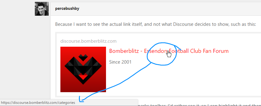
If I want to drop the link onto my bookmarks toolbar, I’d rather see it, so I can highlight it and then copy and paste it. I realise that the full link is behind the text provided by Discourse but I’d rather see the full text up front. Why does it show “discourse dot bomberblitz dot com” in the text and only add the important part “/categories” in the hidden text of the link ?
There’s a control-freak aspect to Discourse, just like many other modern browser apps. That’s why I prefer the older ones with their uncool interfaces — they let you get on with business, without forcing you into the way their coders think you should go.
Some aspects of the new site are really good, others will take a bit of getting used to, others again I’ll never like.
Getting rid of all the nested quotations is fantastic: it will save a lot of time that was wasted trying to scroll down through 100 lines of text to finally get to the new post (often no more than a one-word insult); it will also save a helluva lot of bandwidth !
I’d prefer to have pages back though; I don’t like the new scrollbar on the RH side— for me it’s a waste of space — but I’m on a MacBook Pro: it is probably ver handy for users of iPads.
It would be a big help if you allowed us to decide in Preferences which page we’d like to have as our default home page, btw. My Bookmarks Toolbar work-around doesn’t work if you click on the logo at top left, for example.
Yes, barnz — I know that! But it’s not permanently visible: it only appears bottom left when you hold your mouse over the main text, so you can’t copy it to your clipboard, because you need the mouse for that as well.
Okay, right click, choose “Copy Link Location” from the menu — too much too much… The point is if you’re going to show the link in the text above the logo, it should be the whole link, not just the master part.
Has anyone else lost their access to the sponsor thread for those who put down to be sponsors and it contained all the details of how to pay?
I want to pay, but although I had access under the old thread, it doesn’t seem to be accessible (visible) for me on the new Blitz. I’ve PM’d Koala, she said she would try to tag me in again, but to no avail.
Definitley agree re - the avatars. They need to be bigger, even vanilla was too small but this is smaller. Bigger avatars would help break up all the whiteness. You want to know you’re talking to people not random white boxes.
I don’t know if it’s possible but I did like the old black sidebar down the right that helped break up the whiteness of everything, or perhaps it can be down the left side.
There are aspects I like of this forum, I do like the live updates and stuff. I’m sure Riolio will get it right if we give him a few weeks, it’s hard to expect perfection right off the bat.
I agree re: avatars just because there’s a fair bit of white space. Not because you have to use all white space, but small extension gives avatars more prominence. For those of us who spend too much time on here, you develop a sort of subconscious association with people’s avatars.
I agree with your sentiment. Maybe I am just getting old, but I dont see the need to have badges or statements like ‘elite’ next to a name…I mean just because I cannot afford to donate money to a cause or sponser a player, why should people like myself be different and not be able to have titles? I reckon if you are going to have badges ones like ‘Rookie’ or ‘Veteran’ where everyone gets a chance to achieve it is the way to go.
interesting thing with the title, I switched it on and off previously (I was regular, it looked like it was based off trust level which you earn) after the tweaks it was showing elite but after going in and selecting it again that has disappeared for me.
Also the name was showing up as a title now it’s gone. I’m assuming this was a new tweak also.
The system logs me out every 5 minutes if I access it via MBA, but all day is OK via Mac Pro. On Mac Pro, the “icon link” does not work so the only way to get back to the list of topics is to click in the URL space and hit reload.
Also I can’t see how to make a post without “replying” to someone. That is why I am replying to you when it is not relevant to your comment…
Edit: AFTER I posted this, the general “reply” became available…