Saad almost totally sacrificed his attacking game to stop Toby Greene, which he did quite effectively.
2 Likes
Going to add some analysis of my own, and argue that, despite the superficial similarities to our ‘bad start’ last year, yesterday’s effort was a very different kind of bad.
Our dismal start to 2018 was first and foremost an inability to move the ball. We would end up repeatedly trapped in our back half and treacle slow when we actually won the ball back. This was shown clearly in our i50 differential:
Vs. Fremantle - minus 11
Vs. Bulldogs - minus 12
Vs. Collingwood -MINUS SEVENTEEN
Vs. Melbourne - minus 7
Vs. Hawthorn - minus FIFTEEN
Vs. Carlton- minus 4
Against, the Crows, despite the opinion of some on here that we were ‘lucky’, there was a +7 differential, and +10 vs the Power.
Our improvement last year was, first and foremost, an improvement in ball movement. We hit the positive side of the ledger in all but three of our wins last season and only won once when significantly in arrears (our first quarter demolition job of West Coast) - our successes included an epic +33 result vs the Swans in what was our finest performance in years.
Yet yesterday we only lost the i50 count by 3, the same amount we lost i50 count vs GWS last year (a 35 point victory for us). To lose by as much as we did with such an equivalence of ball entering the forward 50 is pretty blood spectacular. The weekend’s other thrashing, Freo’s route of North Melbourne, was built on a +21 i50 count to Fremantle.
There is, however, one direct comparison - our Dreamtime match vs Richmond last year. Again, a -3 i50 count leading to a 71 point drubbing (out by one!).
So, the question is - was yesterday an unusual statistical outlier caused by a subtropical climate and a switched on opposition, or reflective of defective forward setups and a comically bad backline?
2 Likes
FATMAP
So basically I took all of the players available statistics since 2003 and I turned them into a self organising map (SOM). Basically you set out a lattice of about 900 nodes which each have an average statistical signature worked out smartly by the algorithm to cover the entire population you give it. Each players game or season gets assigned to that node. If a player maps to that node, it is most similar to the other players on that node. The nodes directly adjacent are the second most similar.
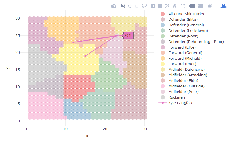
This is Kyles career just using his season averages. He started as a poor forward (yellow), moved into the midfield, briefly moved back into the forward line where he was classed as a “Forward Midfield”, before now being classed on average as a “defensive midfielder”.
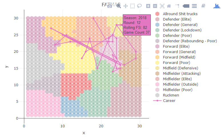
You could also plot every one of his games, its a bit noisy but shows the variation. Sorry for ■■■■■■ colours, I am rushing this out between doing a job.
So players seasons who plot on the node that Kyles 2018 season include:
Does that make sense?
4 Likes
(to me) - Some of it. Some of the ‘trade talk’ is going over my head.
When you say ‘season averages’, what stats are you using?
Can you refine what ‘poor’ ‘average’ ‘elite’ means in the chart and what stats these link to?
In my language, does that mean - 'you allocate stats to areas to make a field and then attach a player within the field closest to where his stats lay?
Not sure if I understand the geographical relationship between node areas - is there one? For example - are all ruckmen very close to being the charmingly-named ‘allround ■■■■ trucks’?
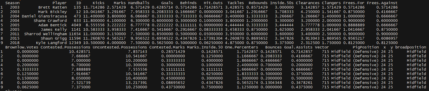
We used the basic suite that has been available since 2003, so the ones you can see in the players similar to Kyle in the last picture.
The poor, average, elite labels are subjective, we added them to the classes. The boundaries, however, are quantitatively derived based on maximum differences between nodes.
And yes, if a ruckman wasn’t getting hitouts, it could easily fall into the ST category. The further the distane between nodes, the more different that players statistical signature is.
1 Like
and do all the “accepted” elite players for specific positions fall where they should on your grid?
…are there any surprises…
Normally, some elite players can’t get what they do captured by statistics (i.e. cyril, Rance).
If you name a few players, I can plot them for you?
Also, the elite category is too broad. At some point I need to add in “semi-elite” or something.
Kind of what I was alluding to. There is quantity (stats) and there is quality. And the quality stuff can be hard to measure or properly captured. But if you are quality you probably do the enough quantity to stand out.
Interesting stuff, Trev.
I’m sorry but where is the born in December node?
2 Likes
What time-period?
I need to label the points, its their entire careers. hang on
please add start and end of career


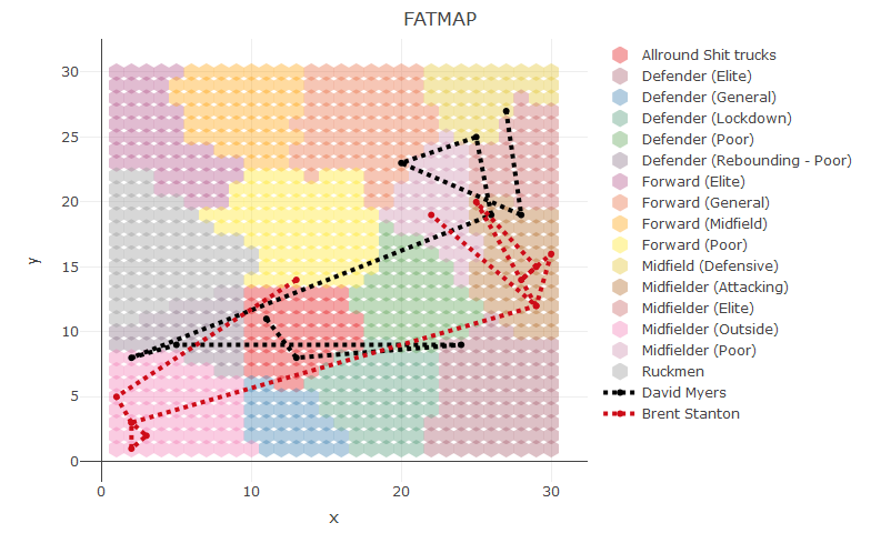
ANy chance you could run it on these guys?
Jamie Elliott
Aaron Sandilands
Paul Puopulo
Josh Kennedy (swans)
Henry Slattery please.
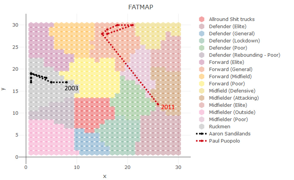
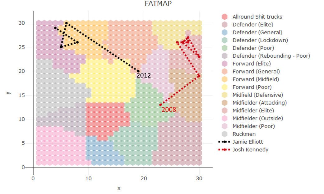
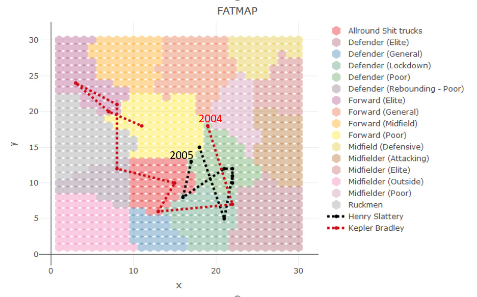
I think that would help as the colours can be difficult to determine, or I’m colour blind!
I am struggling to understand the effectiveness of the tracking. I gather the map sections from the SOM on the output are showing the relative number of players in the categories, but how are you determining a players relative performance (or other metric) from that?